
-
The 2025 Graphic Design Senior capstone exhibition, COMMON GROUND, explores how opposing viewpoints reveal shared truths and foster unity. Through the lens of Communication Design, each project examines the intersection of perspectives, creating space for understanding amid polarization. Design students investigate freedom, rights, and thought from multiple angles, identifying a "common ground" that embraces differences and seeks convergence.
The exhibition presents twenty one transmedia projects that invite viewers to expand their perspectives and engage in dialogue that drives positive transformation.
The Senior Graphic Design Capstone Exhibition is a culmination of each student-designer's development within the program, creating a platform to present their evolution, practice and interests.


MAN UP
MAN UP
Nov 2024 ➜ Apr 2025
A graphic design exhibition campaign that explores how advertising shapes American masculinity. By examining commercial messaging, the campaign reveals how ads exploit male vulnerability, ambition, and insecurity. Through impactful video design, packaging, and retro-inspired ads, Man Up uncovers how marketing reinforces societal pressures while also offering men a sense of identity and belonging. The exhibition highlights shared desires for validation, strength, and self-worth across both traditionalist and progressive ideals, advocating for a more inclusive, self-defined vision of manhood.
Man Up uncovers the common ground between progressive and traditional men through the lens of American advertising.
Exhibition on view at Project for Empty Space from October 17th - 30th, 2025.
This exhibit is free and open to the public.
-
The 2025 Graphic Design Senior capstone exhibition, COMMON GROUND, explores how opposing viewpoints reveal shared truths and foster unity. Through the lens of Communication Design, each project examines the intersection of perspectives, creating space for understanding amid polarization. Design students investigate freedom, rights, and thought from multiple angles, identifying a "common ground" that embraces differences and seeks convergence.
The exhibition presents twenty one transmedia projects that invite viewers to expand their perspectives and engage in dialogue that drives positive transformation.
The Senior Graphic Design Capstone Exhibition is a culmination of each student-designer's development within the program, creating a platform to present their evolution, practice and interests.Designers
-
MY ROLE:
As Design Lead, I directed the exhibition’s visual development from concept through installation and production, creating a cohesive system across environmental graphics, acrylic elements, printed materials, illustrations, and an interactive touchscreen experience.
THE OBJECTIVE:
To transform complex civil-rights information into an accessible, engaging exhibition that empowers visitors to understand and exercise their rights in New Jersey.
TARGET AUDIENCE:
New Jersey residents, particularly students, young adults, activists, and community members seeking clear and practical information about their civil rights.
DIRECTORY:
Adobe Illustrator
Adobe InDesign
Adobe Photoshop
Adobe Premier Pro
Adobe After Effects
Autodesk Fusion 360
Clip Studio Paint
DIRECTORY:
PROJECT:
-
I AM. YOU ARE. WE ARE. FREE TO SPEAK. PROTEST. DISSENT.
DESIGN CONSORTIUM × ACLU OF NEW JERSEYThis exhibition grew from a year-long partnership between the Design Consortium at Express Newark and the ACLU of New Jersey. Rooted in Newark’s legacy of civil rights advocacy and the arts, the exhibition explores how design can help people understand, exercise, and protect their constitutional rights.
Across two semesters, the partners explored communication as a process of meaning-making shaped through dialogue, participation, and shared experience, using design-driven research and co-building to generate new ideas, language, messaging, and forms of dissemination.
Bringing together work developed throughout the collaboration with new installations and participatory experiences created specifically for this exhibition, the work presented encourages reflection, conversation, and civic engagement. Visitors are invited to consider not only the constitutional rights explored here, but also the role communication plays in shaping how those rights are understood, exercised, and defended.
Your rights are here.
Know them. Protect them.
2025 Rutgers University-Newark BFA Graphic Design Senior Capstone
COMMON GROUND : Perspectives on Freedom
Exhibition on view at Project for Empty Space from April 17th - 30th, 2025.
This exhibit is free and open to the public.
Rutgers University-Newark
FOR:
TOOLS:
EXHIBITION - GALLERY DISPLAY

EXHIBITION - GALLERY DISPLAY
The MAN UP gallery brings together illustration, motion graphics, packaging, and interactive installation to examine how masculinity is constructed and performed in American culture. Framed dimensional works, the animated CRT, the fragrance series, and participatory elements create a space that blends gallery display with advertising language, inviting viewers to question the expectations and identities placed on men in America.
MOTION GRAPHICS - “WHAT IS A MAN?”
Presented on a custom clear prison issue CRT television, What is a Man? critiques how advertising and media have historically shaped masculinity. The hand-illustrated visuals evoke vintage ads, while five male voice actors reflect the fragmented, performative nature of manhood. Through this dynamic medium, the video exposes how past ideals can often influence men today.
MOTION GRAPHICS - “WHAT IS A MAN?”
The animated video explores five perspectives examining the pressures, expectations, and performances that shape modern American masculinity.
MOTION GRAPHICS - SEGMENT BREAKDOWN
MOTION GRAPHICS - SEGMENT BREAKDOWN
-
![]()
“What is a Man Without a Suit?”
examines the limited freedom men often face in how they are expected to dress and present themselves in everyday life. The segment questions how rigid ideas of professionalism, masculinity, and respectability can restrict personal expression.
Narrated by David Orozco
-
![]()
“What is a Man Without Muscle?”
examines the unrealistic body standards promoted within extreme bodybuilding culture and the predatory marketing of supplements tied to masculine ideals of strength, size, and physical dominance.
Narrated by Torrin Nugent
-
![]()
“What is a Man Without Money?”
“What is a Man Without Money?” examines the pressure placed on American men to equate masculinity with wealth, status, and material success. The segment critiques how these ideals are relentlessly marketed and how pursuing them can lead to financial strain, insecurity, and harmful measures of self-worth.
Narrated by James Dixon
-
![]()
“What is a Man Without Big Things?”
examines how modern American masculinity is often tied to owning oversized, pristine, and impractical possessions as symbols of status, power, and control. The work questions how consumer culture turns material excess into a performance of masculine identity.
Narrated by Tyler Hogerty
-
![]()
“What is a Man Without His Cool?”
examines toxic stoicism and the pressure placed on men to remain composed, suppress vulnerability, and conceal emotion. The work questions how these expectations can turn emotional repression into destructive coping mechanisms, including alcohol abuse.
Narrated by Naim Ali-Pacheco





MOTION GRAPHICS - ANALOG DESIGN
I sourced a clear RCA Clearview CRT originally made for correctional environments and repurposed it to display the What is a Man? animation. Its transparent casing reinforces the project’s themes of scrutiny and constructed masculinity, while hand-painted graphic details and a telephone handset for low-fidelity audio transform the television into a sculptural extension of the animation.
MOTION GRAPHICS - ANALOG DESIGN
MOTION GRAPHICS - ILLUSTRATION
More than 200 visual assets were digitally illustrated for use in this animation. Once the illustrations were completed, they were then exported into single assets by separating characters, backgrounds, and symbolic details into layered image files for animation.
MOTION GRAPHICS - ILLUSTRATION
MOTION GRAPHICS - PROCESS
After creating the individual assets, each scene was built out as a layered composition in Premiere Pro and After Effects. Foregrounds, backgrounds, and animated elements were arranged to create depth, while keyframes, opacity shifts, parallax, and scale changes added controlled motion and pacing to the hand-drawn artwork.
MOTION GRAPHICS - PROCESS
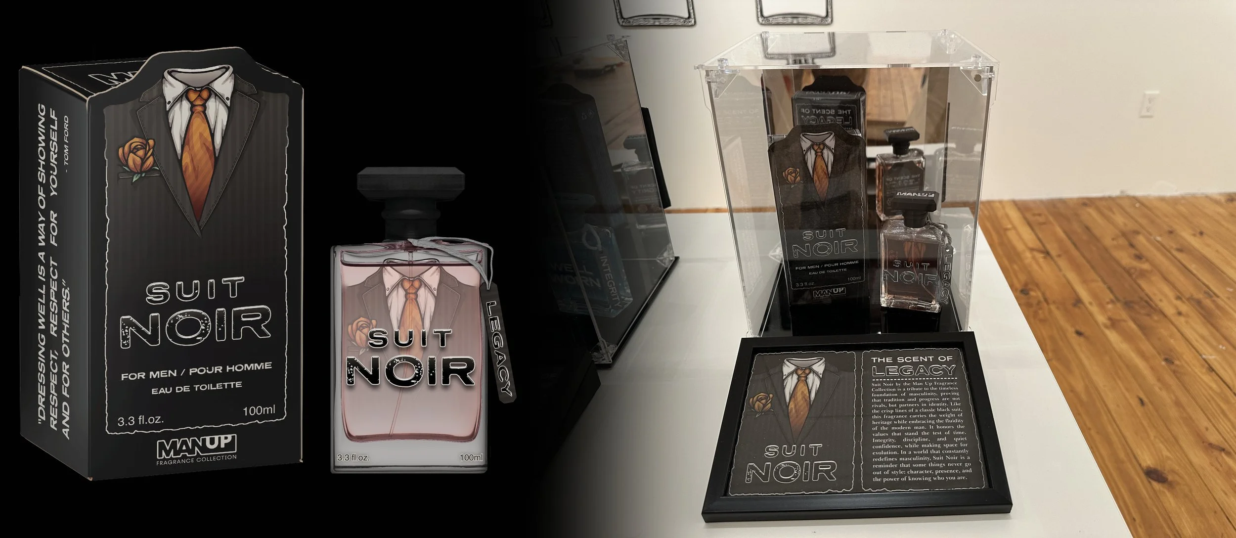
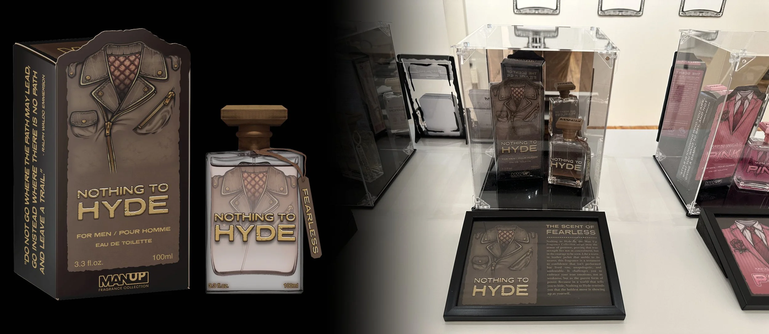
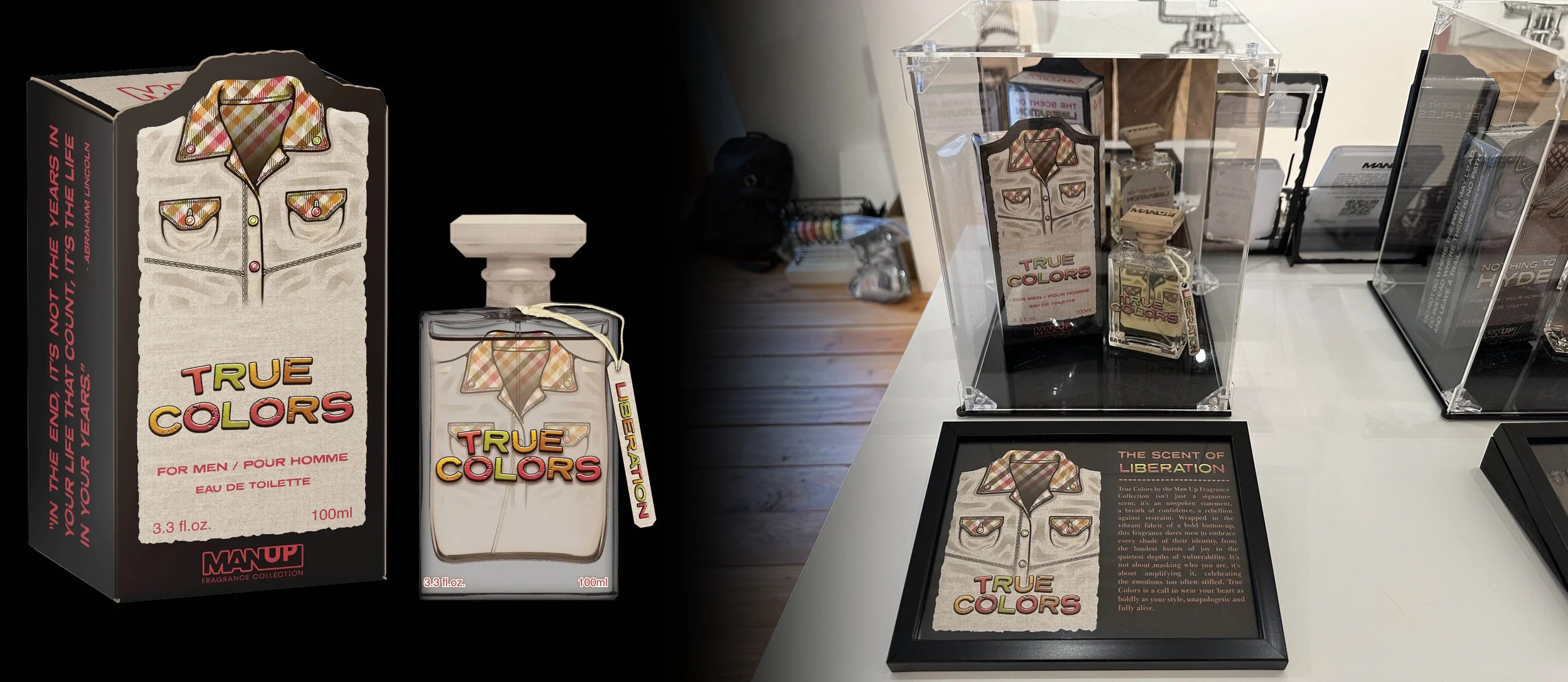
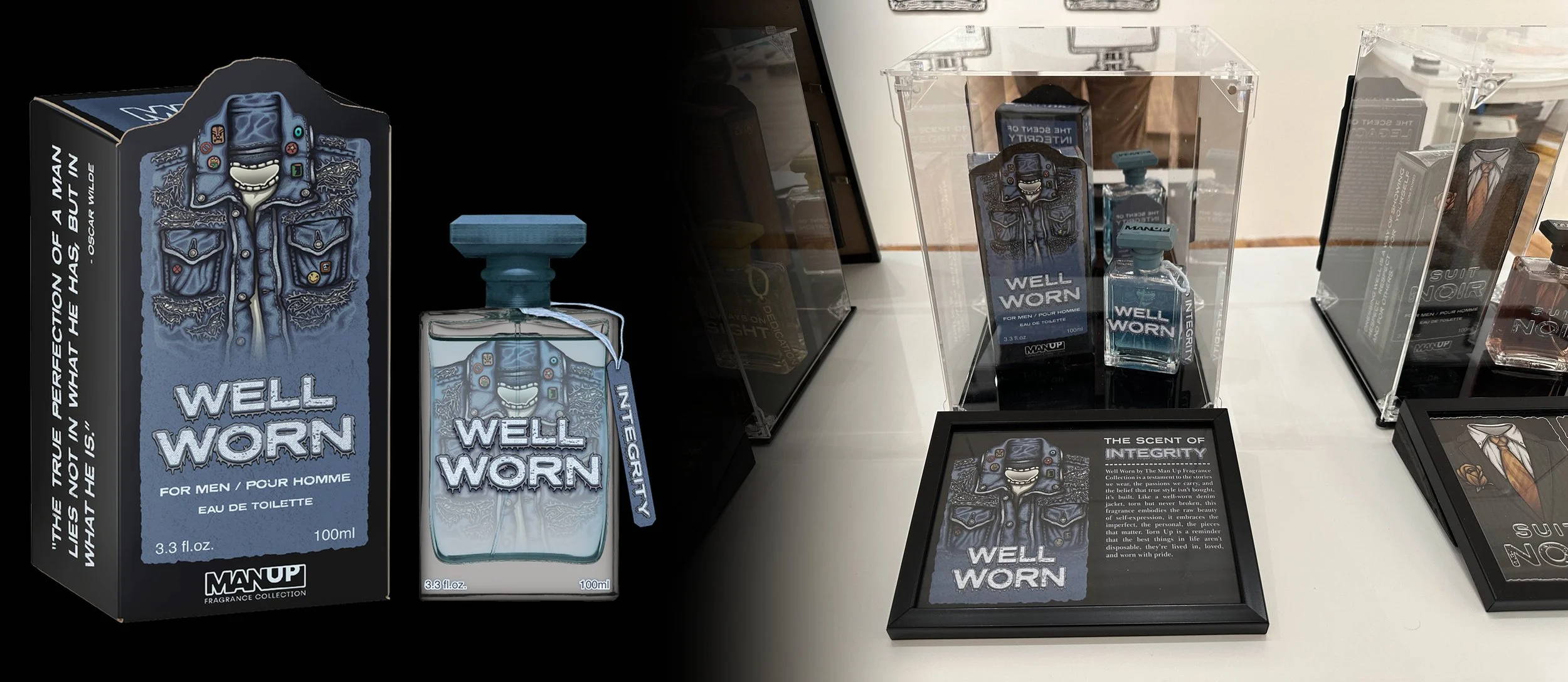
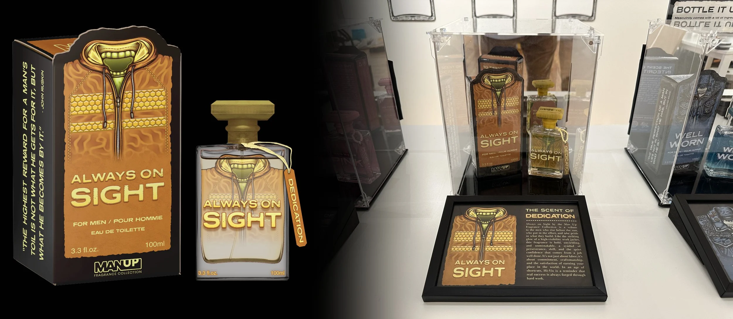
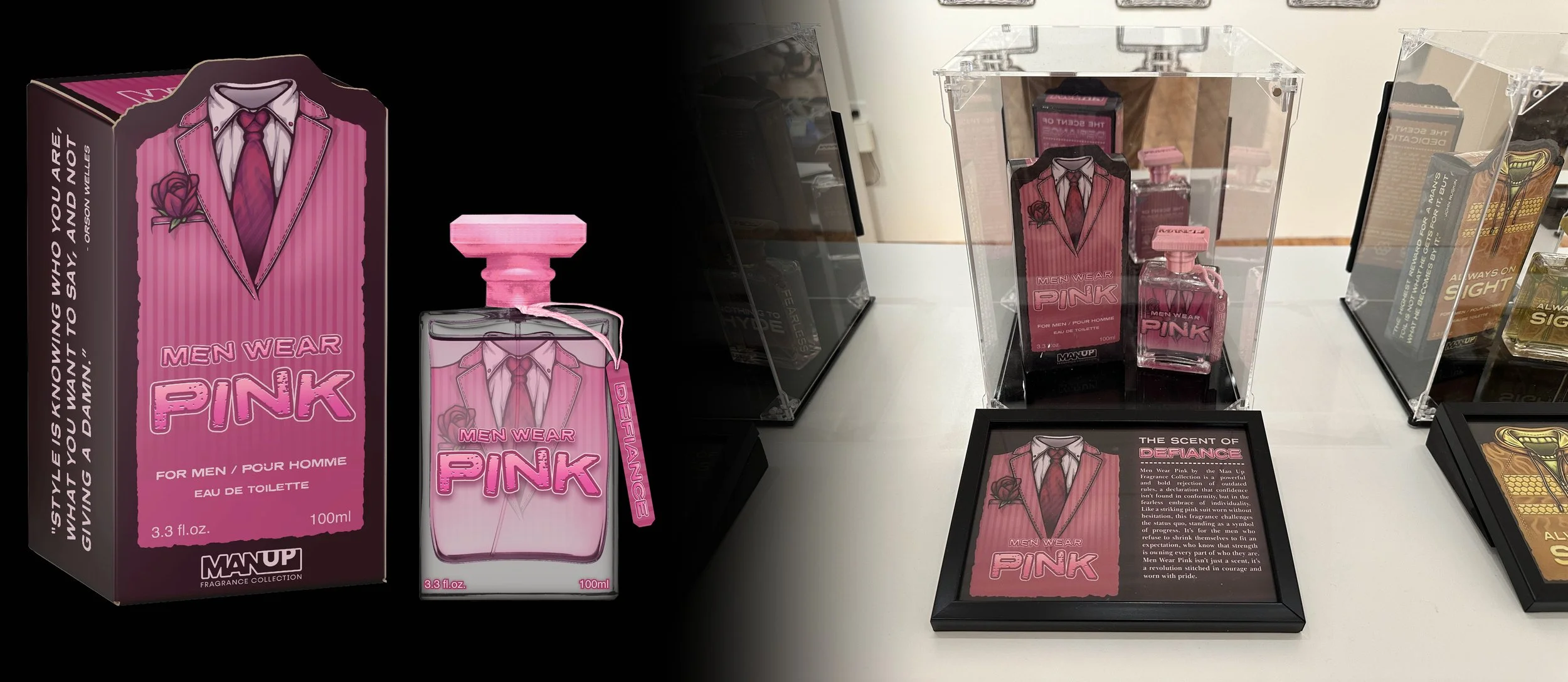
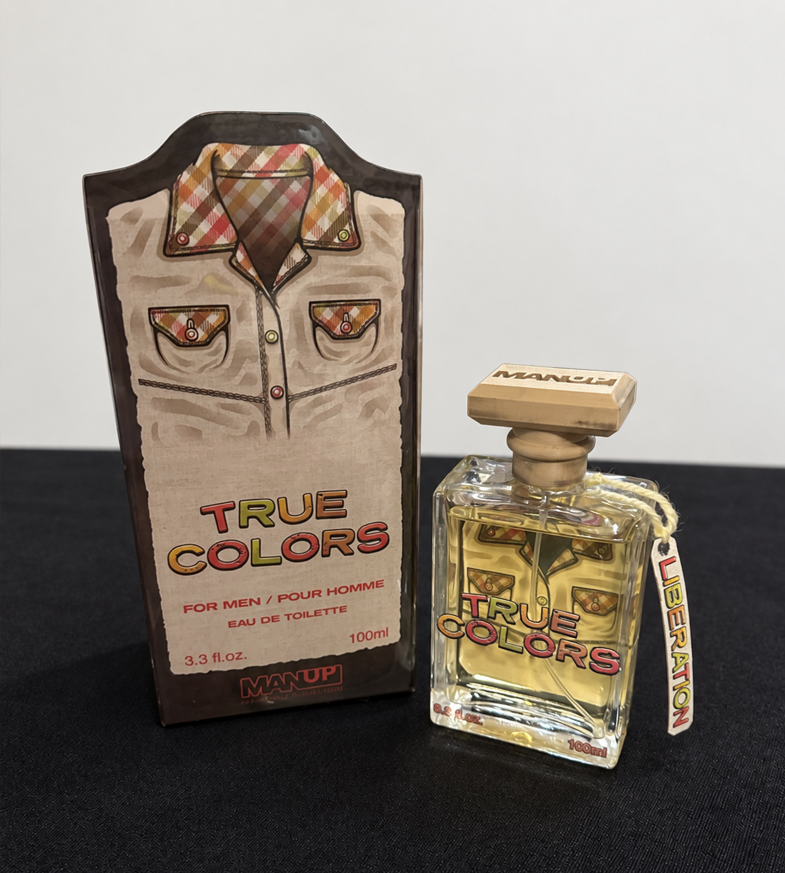
The six-part fragrance series responds directly to the pressures explored in What Is a Man?, transforming expectations around appearance, emotion, status, and conformity into opportunities for self-expression. Through clothing and scent, each fragrance represents a different masculine identity, releasing the individuality and emotion that those pressures often keep “bottled up.”
PACKAGE DESIGN - FRAGRANCE COLLECTION
PACKAGE DESIGN - FRAGRANCE COLLECTION
The mural spanning across the west entrance wall of the exhibit.
Mural and exhibit title wall in the introduction gallery hallway.
-
![]()
SUIT NOIR
The Suit Noir bottle and package draws from the timeless image of the black suit, honoring its associations with discipline and formality while reframing it for a more modern, expressive masculinity.
-
![]()
NOTHING TO HYDE
The Nothing To Hyde leather jacket imagery symbolizes both toughness and vulnerability. Traditionally worn as a protective outer layer, its worn-in character suggests an identity shaped by experience, reinforcing Nothing to Hyde’s message that real confidence comes from authenticity rather than emotional armor.
-
![]()
TRUE COLORS
The patterned shirt of True Colors represents self-expression and individuality. Its bold colors reject the idea that masculinity must be restrained or uniform, reinforcing True Colors as a celebration of confidence through personal style, openness, and authenticity.
-
![]()
WELL WORN
The patterned shirt of True Colors represents self-expression and individuality. Its bold colors reject the idea that masculinity must be restrained or uniform, reinforcing True Colors as a celebration of confidence through personal style, openness, and authenticity.
-
![]()
ALWAYS ON SIGHT
The high-visibility work jacket represents dedication, dependability, and pride in showing up. Its utilitarian design reinforces Always On Sight as a celebration of masculinity built through presence, effort, and being someone others can count on.
-
![]()
MEN WEAR PINK
The pink suit challenges the idea that masculinity must avoid softness or femininity. Its bold color transforms a traditional symbol of formality into an expression of confidence, reinforcing Men Wear Pink as a celebration of individuality and freedom from restrictive gender expectations.
PACKAGE DESIGN - PROCESS
Suit Noir uses the black suit, red tie, and roses to contrast traditional masculine control with tenderness, reframing the “classic” male image through emotion and restraint.
PACKAGE DESIGN - PROCESS
This three-part shadow box series expands the visual language of the MAN UP fragrance collection, translating its masculine clothing based archetypes from packaging into layered physical scenes. Each piece builds on the identities established by the fragrances, using symbolism and composition to question how masculinity is marketed, performed, and consumed.
ADVERTSING - SHADOW BOX SERIES
ADVERTISING - SHADOW BOX SERIES
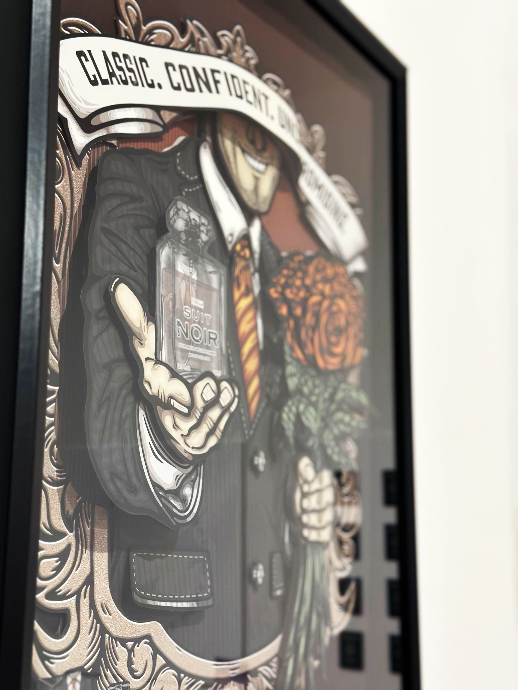
Suit Noir uses the black suit, red tie, and roses to contrast traditional masculine control with tenderness, reframing the “classic” male image through emotion and restraint.
ADVERTISING - SUIT NOIR
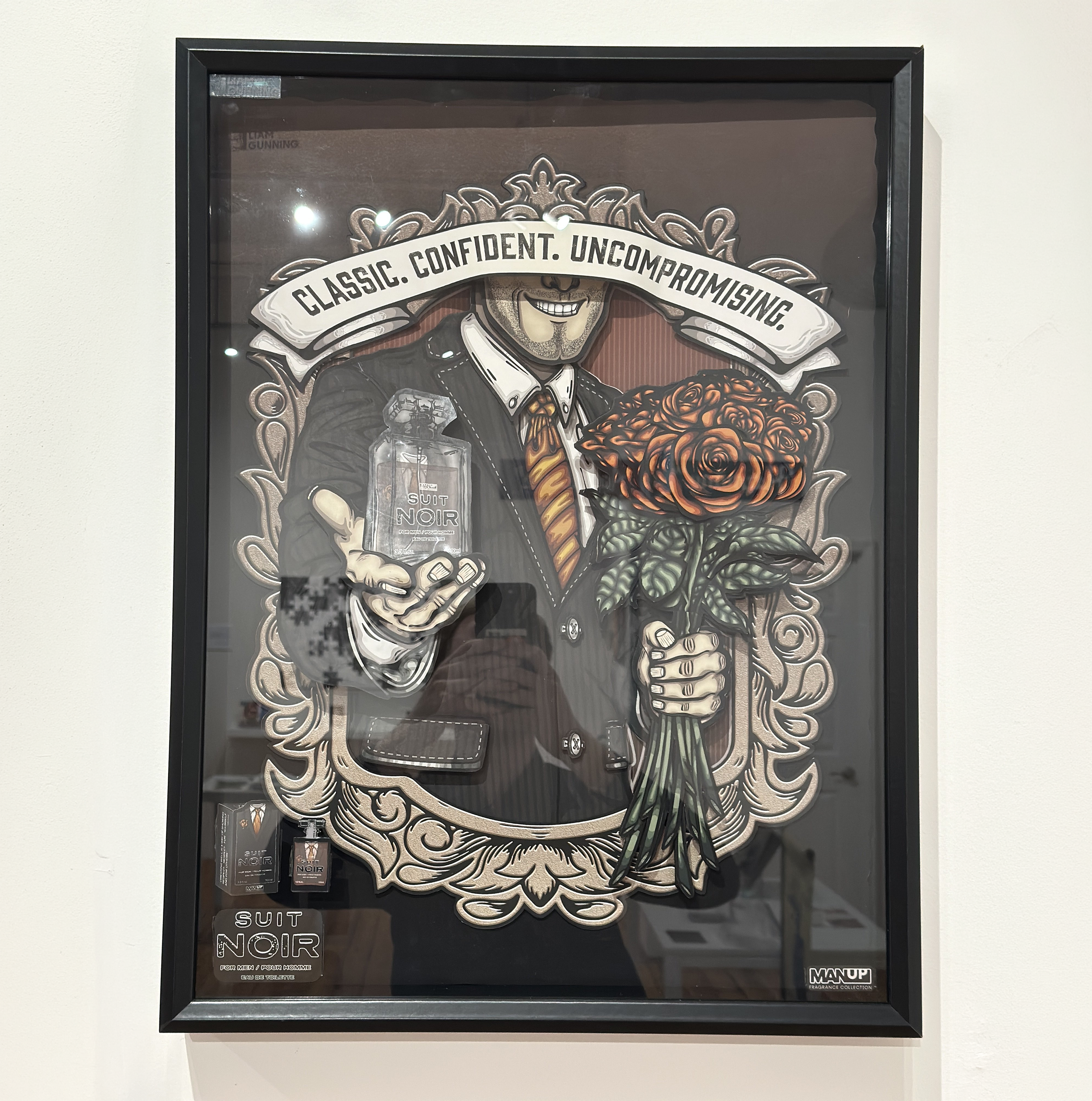
ADVERTISING - SUIT NOIR
Nothing to Hyde uses the leather jacket, fragrance bottle, and smoke to represent masculinity without emotional armor, framing authenticity and vulnerability as forms of strength.
ADVERTISING - NOTHING TO HYDE
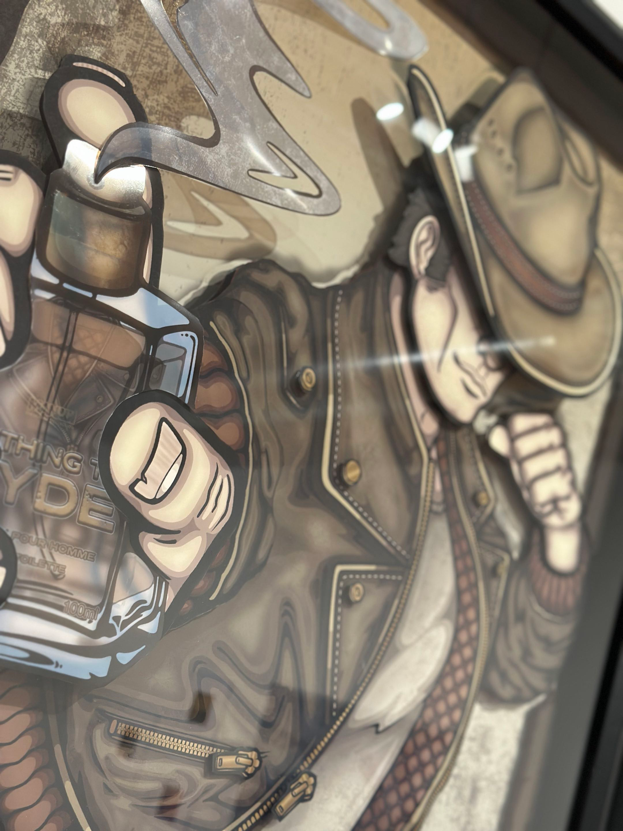
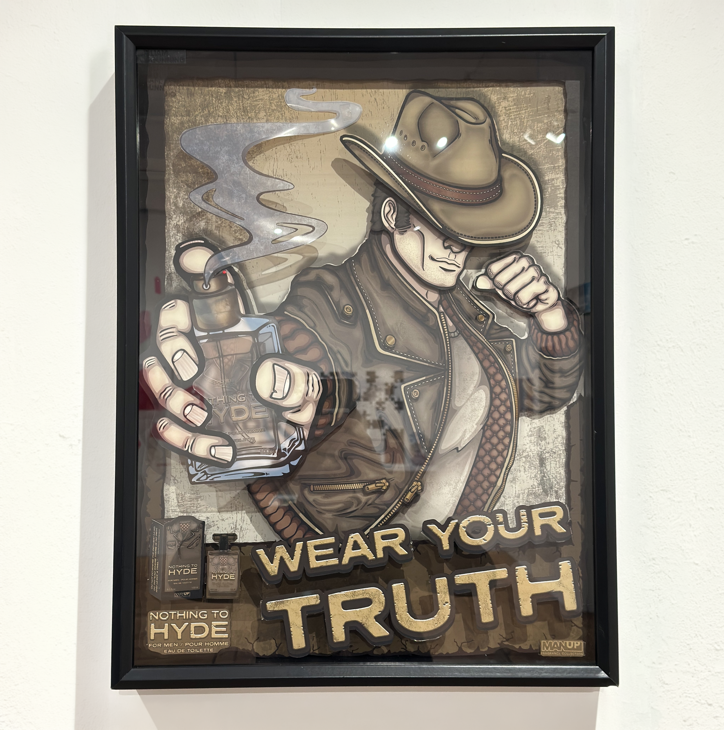
ADVERTISING - NOTHING TO HYDE
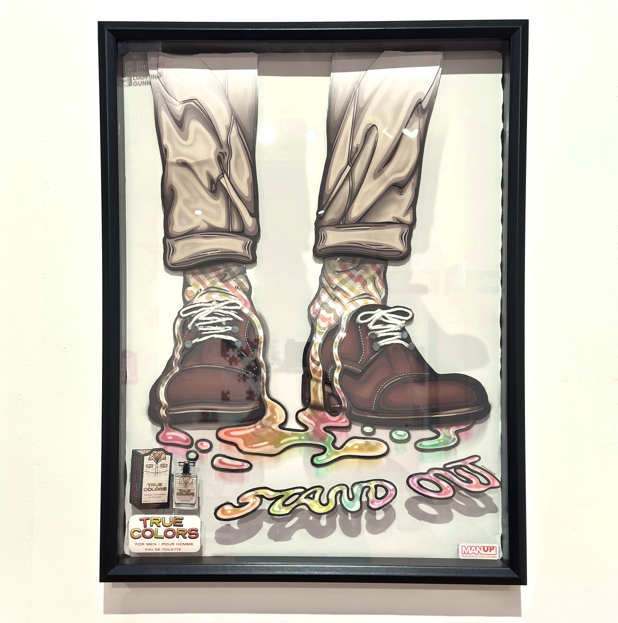
True Colors pairs classic dress shoes with patterned socks and the raised “Stand Out” lettering to contrast convention with individuality. The surrealist, colorful details represent breaking away from rigid expectations and embracing personal expression.
ADVERTISING - TRUE COLORS
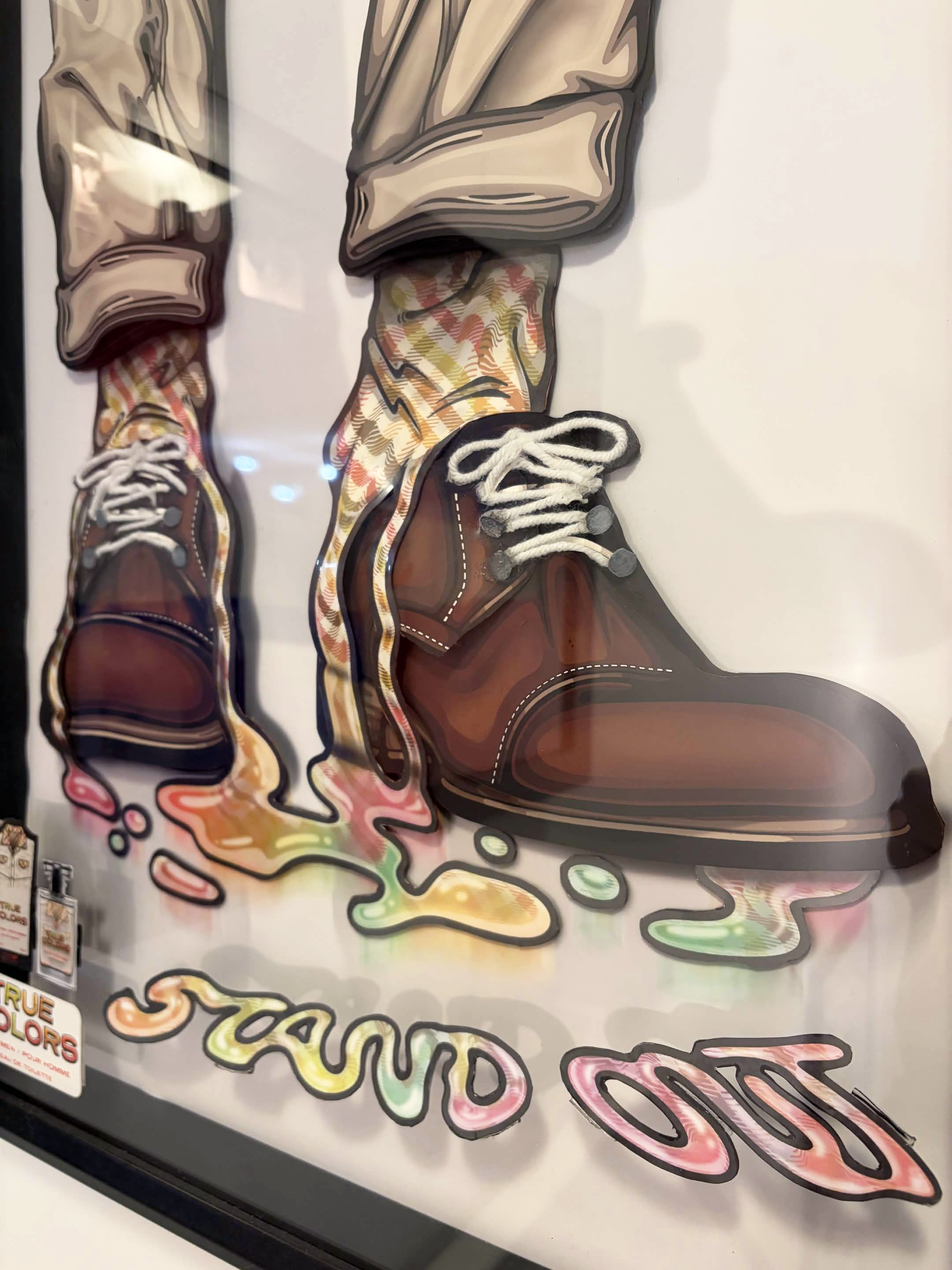
ADVERTISING - TRUE COLORS
True Colors pairs classic dress shoes with patterned socks and the raised “Stand Out” lettering to contrast convention with individuality. The surrealist, colorful details represent breaking away from rigid expectations and embracing personal expression.
ADVERTISING - PROCESS
ADVERTISING - PROCESS
The Break Free graphic t-shirt transforms the imagery of masculine strength into a wearable statement about liberation. The flexing figure breaking through the CRT television represents pushing beyond rigid advertisements of what a man should be, while the T-shirt itself turns the message into something personal, public, and expressive.
MERCHANDISE - GRAPHIC T-SHIRTS
MERCHANDISE - GRAPHIC T-SHIRT
The MAN UP lenticular keychain miniaturizes the exhibition’s CRT imagery into an interactive takeaway. As the Break Free graphic shifts with the viewing angle, it reinforces the idea that masculinity is not fixed, but changes through perspective, expression, and choice.
MERCHANDISE - LENTICULAR KEYCHAINS
MERCHANDISE - LENTICULAR KEYCHAINS
MERHCHANDISE - PRINT TAKEAWAYS
The print takeaways extend MAN UP beyond the gallery, giving all visitors a physical piece of the project to carry with them. Three postcards reproduce the shadow box designs, while the Break Free stickers translate the T-shirt graphic into a smaller, free giveaway format.
MERCHANDISE - PRINT TAKEAWAYS
When developing MAN UP, my goal was to examine the pressures that shape modern masculinity and turn those expectations into something tangible easier to question.
Across animation, illustration, fragrance packaging, dimensional shadow boxes, interactive participation, and exhibition design, the project transforms ideas surrounding emotion, appearance, wealth, strength, and status into experiences that expose how masculinity is often a performance that some embrace while others feel pressured by.
Ultimately, MAN UP is about more than critiquing traditional masculine stereotypes. It is about creating space for men to define themselves beyond those expectations, encouraging greater freedom in how they dress, feel, express themselves, and understand what masculinity can be.
CLOSING REMARKS
CLOSING REMARKS
When developing MAN UP, my goal was to examine the pressures that shape modern masculinity and turn those expectations into something visual, physical, and easier to question.
Across animation, illustration, fragrance packaging, dimensional shadow boxes, interactive participation, and exhibition design, the project transforms ideas surrounding emotion, appearance, wealth, strength, and status into experiences that expose how masculinity is often packaged, advertised, and performed.
Ultimately, MAN UP is about more than critiquing traditional masculine stereotypes. It is about creating space for men to define themselves beyond those expectations, encouraging greater freedom in how they dress, feel, express themselves, and understand what masculinity can be.

-
All research, writing, and designs for MAN UP were created by Liam Gunning.
Fabrication Assistance
Jhoselyn Contreras & Form Design Studio - Associate Teaching Professor Keary RosenCOMMON GROUND: Perspectives on Freedom — Exhibitors
Jhoselyn Contreras, James Dixon, Elizabeth Frias, Liam Gunning, Alexis Irizarry, Jazmyne Johnson, Nathalie Lantigua, Vylette McKnight, Nikolas Mclean, Alyssandre Mertz, Jia Ni, David Ostrovski, Mansi Patel, Brandon Patino, Nihaal Pawaskar, Kaviyan Ravindrakumar, Robert Rios, Yulisbeth Rojas, Jammie Senario, Jean Weekes, Camilla ZarzuelaCourse Instruction & Exhibition Direction
Led by Professors Chantal Fischzang and Ricardo Frederick.
This project was created for / in collaboration with the following organizations:
This project was created for / in collaboration with the following organizations:
2026 Liam Luke Gunning - All Rights Reserved
gunning.art
liamgunningart@gmail.com