
-
In Spring 2025, The Design Consortium partnered with the Newark City Parks Foundation to help reimagine and elevate its brand identity, aligning it more closely with the organization’s impact and presence across Downtown Newark.
Shaped by the forms and stories of Newark’s parks, this new identity directly acknowledges the five downtown parks and the role they play in bringing communities together. By simplifying the outlines of each park’s aerial footprint and softening their edges, students created a design that feels welcoming and familiar, one that reflects the shared spaces where Newark comes to gather, play, and unite.
This reimagined visual identity is now visible citywide, spanning digital and print applications including a refreshed community calendar, streetlight and feather banners, headquarters graphics, a redesigned website, and more. The exhibition explores the power of collaboration, demonstrating how curriculum can become a catalyst for community-based design, resulting in meaningful, research-driven systems that serve the public with clarity and care.


NEWARK CITY PARKS
Jan ➜ Oct 2025
A brand identity and exhibition project developed through the Rutgers University-Newark Design Consortium for the Newark City Parks Foundation, connecting five downtown parks through a unified visual system, environmental graphics, and exhibition design.
NCPF manages and activates Lincoln Park, Military Park, Mulberry Commons, Riverfront Park, and Harriet Tubman Square. The project celebrated each park’s distinct character while strengthening the foundation’s visual presence across print, digital, and public spaces.
Exhibition on view at Express Newark from October 7th, 2025 to July 9th, 2026.
This exhibit is free and open to the public.
-
In Spring 2025, The Design Consortium partnered with the Newark City Parks Foundation to help reimagine and elevate its brand identity, aligning it more closely with the organization’s impact and presence across Downtown Newark.
Shaped by the forms and stories of Newark’s parks, this new identity directly acknowledges the five downtown parks and the role they play in bringing communities together. By simplifying the outlines of each park’s aerial footprint and softening their edges, students created a design that feels welcoming and familiar, one that reflects the shared spaces where Newark comes to gather, play, and unite.
This reimagined visual identity is now visible citywide, spanning digital and print applications including a refreshed community calendar, streetlight and feather banners, headquarters graphics, a redesigned website, and more. The exhibition explores the power of collaboration, demonstrating how curriculum can become a catalyst for community-based design, resulting in meaningful, research-driven systems that serve the public with clarity and care.
-
MY ROLE:
As Design Lead, I directed the exhibition’s visual development from concept through installation and production, creating a cohesive system across environmental graphics, acrylic elements, printed materials, illustrations, and an interactive touchscreen experience.
THE OBJECTIVE:
To transform complex civil-rights information into an accessible, engaging exhibition that empowers visitors to understand and exercise their rights in New Jersey.
TARGET AUDIENCE:
New Jersey residents, particularly students, young adults, activists, and community members seeking clear and practical information about their civil rights.
DIRECTORY:
Adobe Illustrator
Adobe InDesign
Adobe Photoshop
Adobe Premier Pro
Adobe After Effects
Clip Studio Paint
DIRECTORY:
ROLES
Graphic Designer
Exhibition Designer
Exhibition on view at Express Newark from October 7th, 2025 to July 9th, 2026.
This exhibit is free and open to the public.
Newark City Parks Foundation
The Design Consortium
FOR
TOOLS
-
I AM. YOU ARE. WE ARE. FREE TO SPEAK. PROTEST. DISSENT.
DESIGN CONSORTIUM × ACLU OF NEW JERSEYThis exhibition grew from a year-long partnership between the Design Consortium at Express Newark and the ACLU of New Jersey. Rooted in Newark’s legacy of civil rights advocacy and the arts, the exhibition explores how design can help people understand, exercise, and protect their constitutional rights.
Across two semesters, the partners explored communication as a process of meaning-making shaped through dialogue, participation, and shared experience, using design-driven research and co-building to generate new ideas, language, messaging, and forms of dissemination.
Bringing together work developed throughout the collaboration with new installations and participatory experiences created specifically for this exhibition, the work presented encourages reflection, conversation, and civic engagement. Visitors are invited to consider not only the constitutional rights explored here, but also the role communication plays in shaping how those rights are understood, exercised, and defended.
Your rights are here.
Know them. Protect them.
BRANDING - RESEARCH
BRANDING - RESEARCH

Our initial research explored Newark’s cartography and cultural identity through historic maps, stained-glass mosaics, and the NEWARK landmark sign located at Lincoln Park. These references highlighted the city as a colorful mosaic of intersecting streets, public spaces, and diverse communities, each contributing to Newark’s shared character.
BRANDING - PREVIOUS LOGO BREAKDOWN
We separated the original logo into its core line forms and tree shapes, using these elements as the foundation for the brand’s advancement. Reworking these familiar components allowed us to develop a more flexible visual system while preserving a recognizable connection to the previous logo mark.
BRANDING - OLD LOGO BREAKDOWN
BRANDING - LOGO IDEATION
Our initial research explored Newark’s cartography and cultural identity through historic maps, stained-glass mosaics, and the NEWARK landmark sign located at Lincoln Park. These references highlighted the city as a colorful mosaic of intersecting streets, public spaces, and diverse communities, each contributing to Newark’s shared character.
BRANDING - LOGO IDEATION
BRANDING - LOGO DESIGN
Building on the original mark’s line forms and tree shapes, the final logo introduces a refreshed identity rooted in Newark’s interconnected streets, parks, and communities. It maintains a recognizable connection to NCPF’s previous logo while establishing a unified foundation for the five park identities, balancing their individual character with a shared sense of place.
BRANDING - LOGO DESIGN
BRANDING - TYPOGRAPHY
As we expanded the new NCPF brand identity, selecting the right typeface was essential to reinforcing the project’s visual and conceptual themes. Brandon Grotesque was chosen for its ability to balance a dynamic industrial aesthetic with a bold yet approachable appearance. Its strong, sharp lines echo the structured elements of cartography and Newark’s urban landscape, while the rounded edges maintain a sense of playfulness and accessibility.
BRANDING - TYPOGRAPHY
BRANDING - COLOR PALETTE
We chose a vibrant palette to celebrate Newark’s cultural diversity and the energy of its communities. Each park is represented by a color within the primary palette, giving it a distinct identity. Like a mosaic, the colors retain their individuality while forming a unified whole, reflecting how Newark’s parks bring people from different backgrounds together.
BRANDING - COLOR PALETTE
BRANDING - LOGO LOCKUP
The final lockup pairs a mosaic-inspired tree symbol with bold, stacked typography. Five colored sections represent the individual parks, bringing them together within one shared mark. “Newark” and “City Parks” lead the hierarchy, while the lighter, widely spaced “Foundation” provides balance below, creating a cohesive signature that connects the five park identities.
BRANDING - LOGO LOCKUP
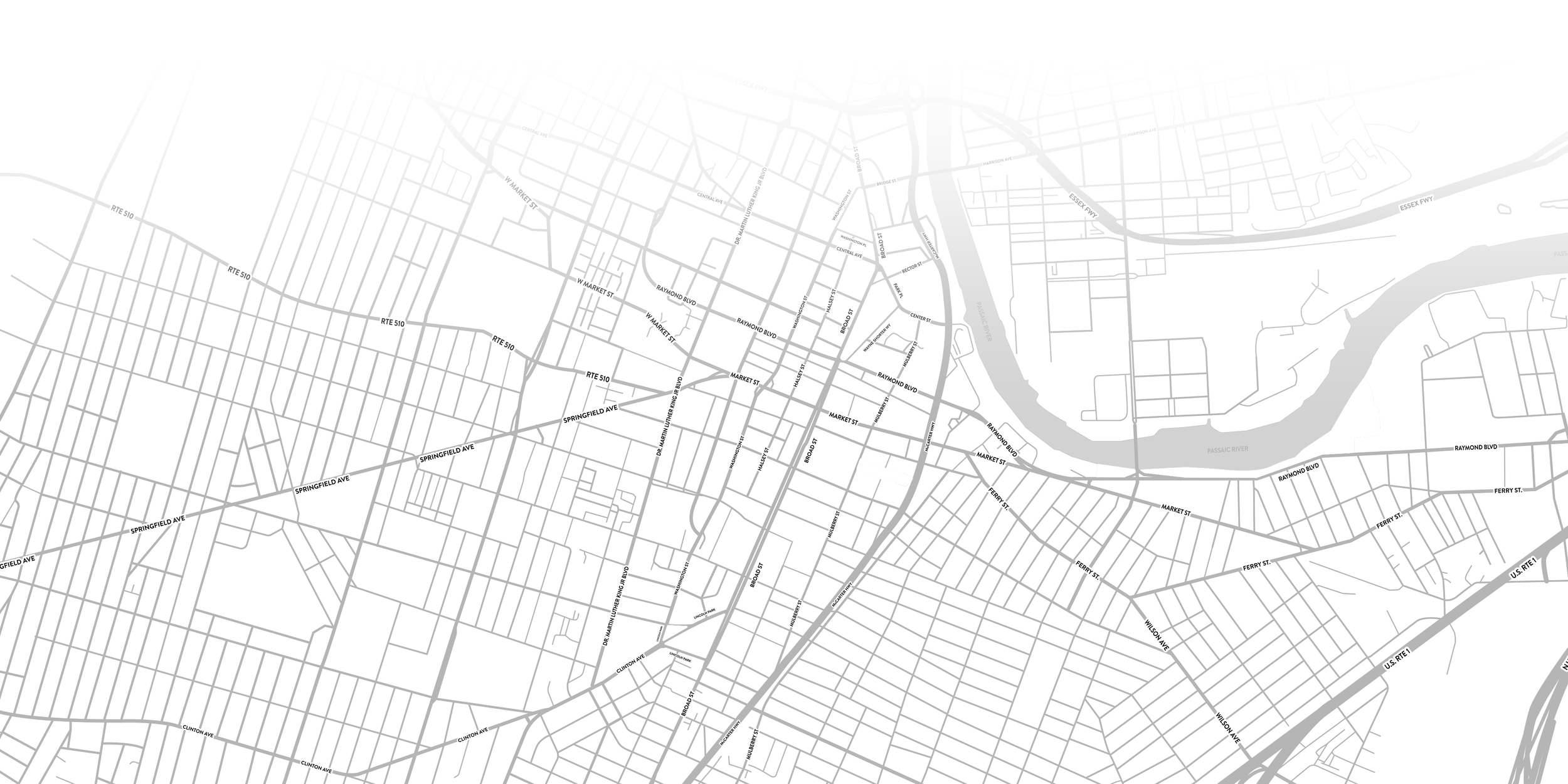

SUB IDENTITY - THE FIVE PARKS
The park sub-identities extend the NCPF brand across its five locations, giving each park a distinct expression through its assigned color and geographic shape. Shared typography and graphic elements connect the identities as a family, allowing each park’s individual character to stand out while maintaining a clear connection to the foundation.
SUB IDENTITY - THE FIVE PARKS
Harriet Tubman Square

Military Park

Mulberry Commons
Riverfront Park

Mulberry Commons
Lincoln Park

Lincoln Park

SUB IDENTITY - HARRIET TUBMAN SQUARE

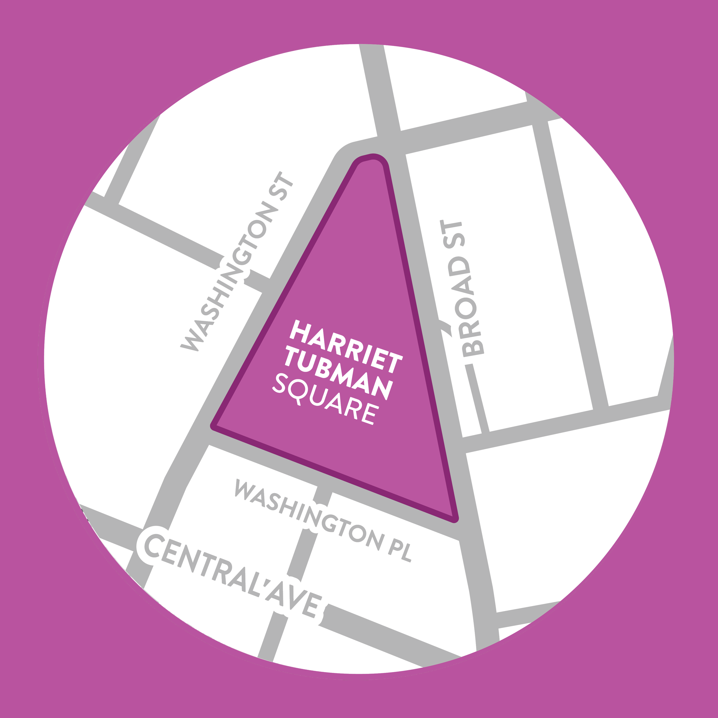
The Harriet Tubman Square identity pairs a distinctive purple palette with a mark drawn from its central monument celebrating Harriet Tubman and her legacy at the heart of the identity.
SUB IDENTITY - HARRIET TUBMAN SQUARE

SUB IDENTITY - LINCOLN PARK

The Lincoln Park identity celebrates the park’s musical character through a bold blue palette and a stylized trumpet mark.
SUB IDENTITY - LINCOLN PARK

SUB IDENTITY - MILITARY PARK

The Military Park identity celebrates the park’s historical spirit through a vibrant green palette and imagery inspired by its iconic carousel.
SUB IDENTITY - MILITARY PARK

SUB IDENTITY - MULBERRY COMMONS

The Mulberry Commons identity captures the park’s playful character through a bold red palette and looping forms inspired by its iconic playground equipment.
SUB IDENTITY - MULBERRY COMMONS

SUB IDENTITY - RIVERFRONT PARK

The Riverfront Park identity celebrates its connection to the Passaic River through a vibrant orange palette and a visual system rooted in its waterfront setting.
SUB IDENTITY - RIVERFRONT PARK
EXHIBITION - INTRO & TITLE WALL
The NCPF × Design Consortium exhibition showcases our Spring 2025 collaboration to reimagine the foundation’s visual identity. Through colorful murals, park maps, and printed materials, the exhibition traces the brand’s development from research to citywide applications, celebrating Newark’s five downtown parks and the role of community-based design in bringing people together.
EXHIBITION - INTRO & TITLE WALL
The complete set features the NCPF logo and all five park marks, packaged beneath a coordinated green header card.
EXHIBITION - MURAL & DISPLAY CASE
The mural brings NCPF’s visual identity into the exhibition through a colorful mosaic of park-inspired forms and photographs of Newark. Each park’s distinct color frames scenes of community life, while bold phrases highlight the parks as places to gather, play, celebrate, learn, and reflect.
EXHIBITION - MURAL
The complete set features the NCPF logo and all five park marks, packaged beneath a coordinated green header card.
EXHIBITION - PARK SPOTLIGHTS
The circular map frames highlight each park’s footprint within Newark’s surrounding streets. Each map uses its park’s signature color, connecting geography to the NCPF identity while giving visitors a closer look at the parks that this brand serves.
EXHIBITION - SUB IDENTITY FRAMES
The complete set features the NCPF logo and all five park marks, packaged beneath a coordinated green header card.
EXHIBITION - PROCESS SHELF
An oversized NCPF logo anchors the wall above a shelf exploring the mark’s concept and form. Colored acrylic pieces connect each section to its corresponding park, while a design process book invites visitors to explore the research and development behind the identity.
EXHIBITION - PROCESS SHELF
The complete set features the NCPF logo and all five park marks, packaged beneath a coordinated green header card.
EXHIBITION - PHOTOGRAPHIC WORDMARK
This wall display highlights the typography behind NCPF’s new identity, filling the wordmark letters with colorful photographs of Newark’s parks and communities. The shelf below introduces Brandon Grotesque and the wordmark’s type hierarchy, connecting the finished design to the choices that shaped it.
EXHIBITION - PHOTOGRAPHIC WORDMARK
The complete set features the NCPF logo and all five park marks, packaged beneath a coordinated green header card.
EXHIBITION - SUB IDENTITY BANNERS
EXHIBITION - PHOTOGRAPHIC WORDMARK
This display brings the five park sub-identities together through hanging banners and circular framed marks. Each banner in this display can also be viewed on site at each of the five parks.
The complete set features the NCPF logo and all five park marks, packaged beneath a coordinated green header card.
EXHIBITION - COLLABORATION WALL
The final wall in the exhibit celebrates the collaboration between Design Consortium students, NCPF, and community stakeholders. A colorful mosaic of process photographs surrounds a feature on the foundation’s headquarters wrap in Military Park, connecting the team’s research, conversations, and presentations to the identity’s presence in Newark.
EXHIBITION - PHOTOGRAPHIC WORDMARK
The complete set features the NCPF logo and all five park marks, packaged beneath a coordinated green header card.
PUBLIC INSTALLATION - HEADQUARTERS
The NCPF headquarters located in Military Park brings the brand to life through a colorful facade wrap. cartographic shapes, photography, and the Newark City Parks wordmark create a recognizable identity and reinforce the NCPF’s presence within the park.
EXHIBITION - PHOTOGRAPHIC WORDMARK
The complete set features the NCPF logo and all five park marks, packaged beneath a coordinated green header card.
STATIONERY - STICKER SET
STATIONERY - STICKER SET
The NCPF sticker set brings the foundation’s logo and all five park sub-identities together in a physical collectible format.
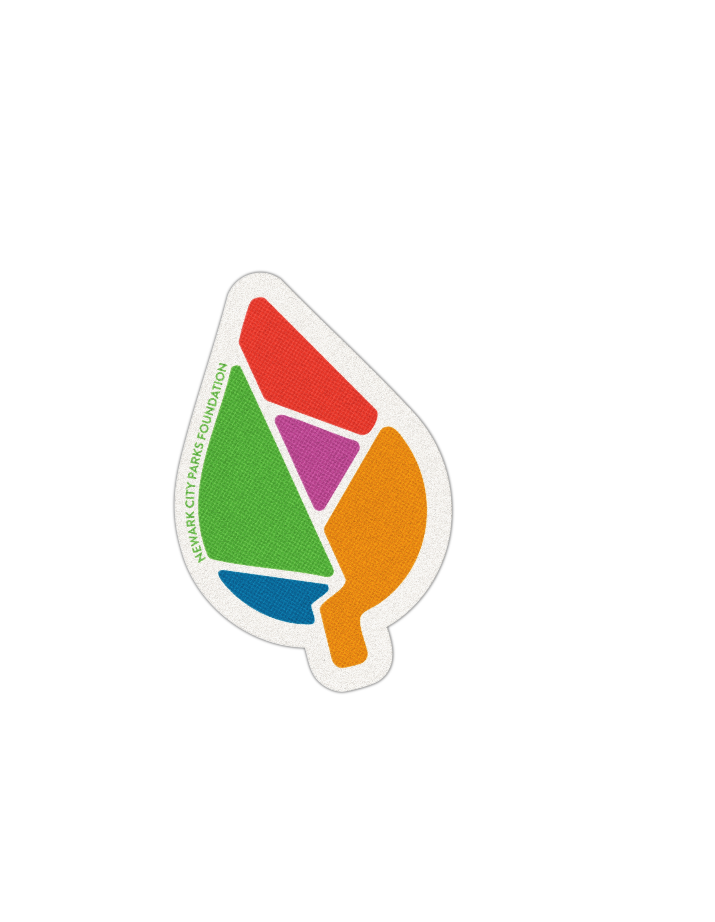
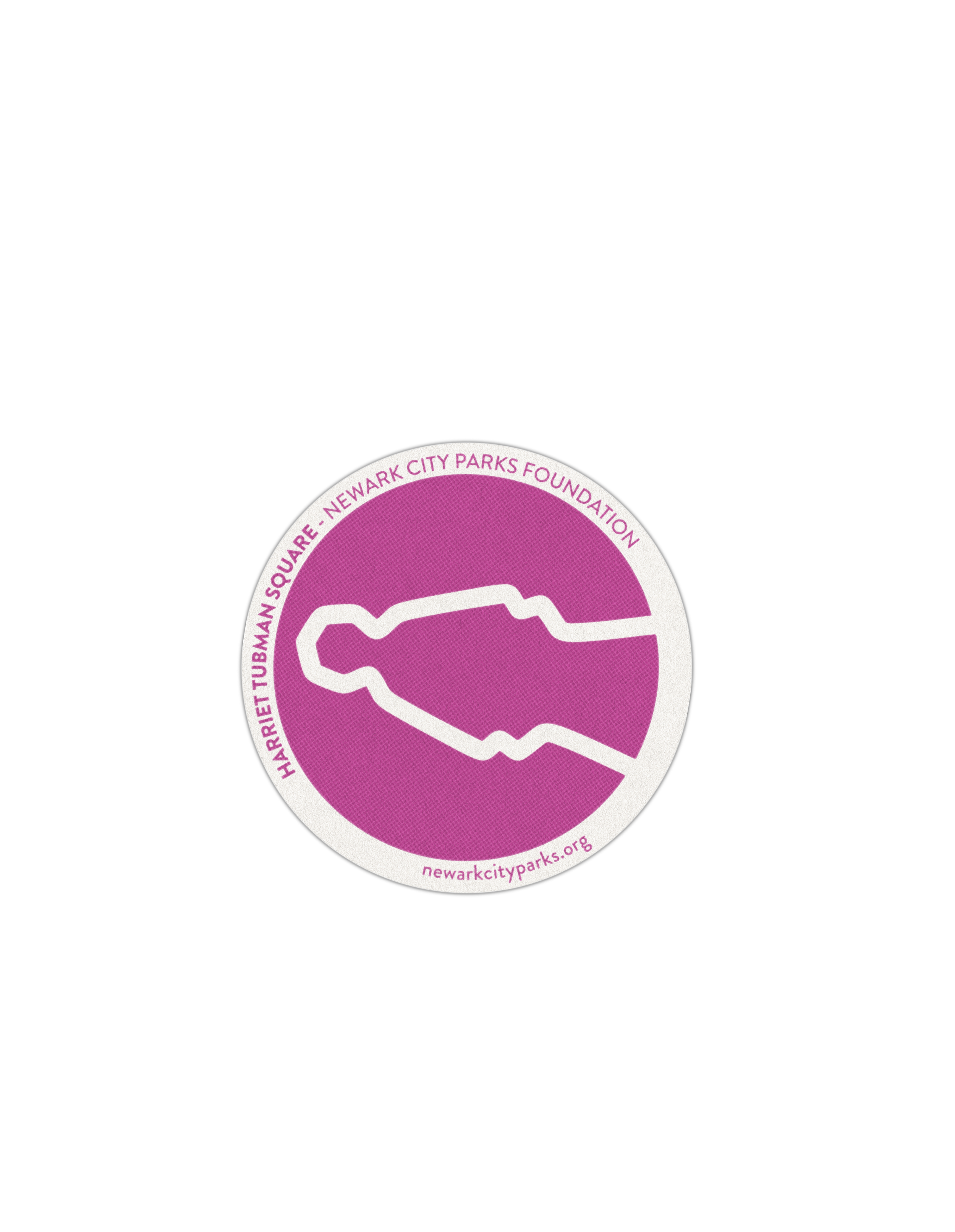
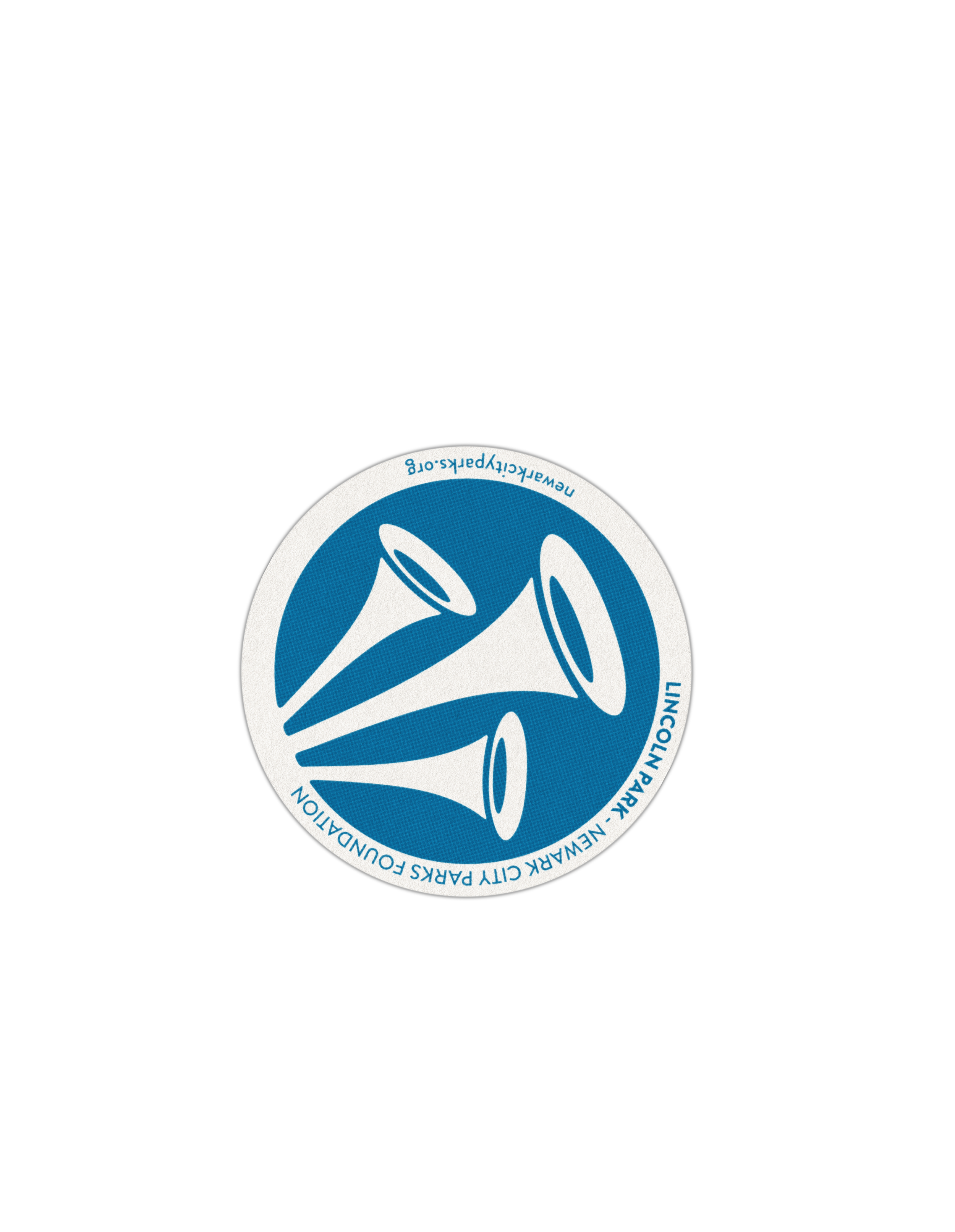
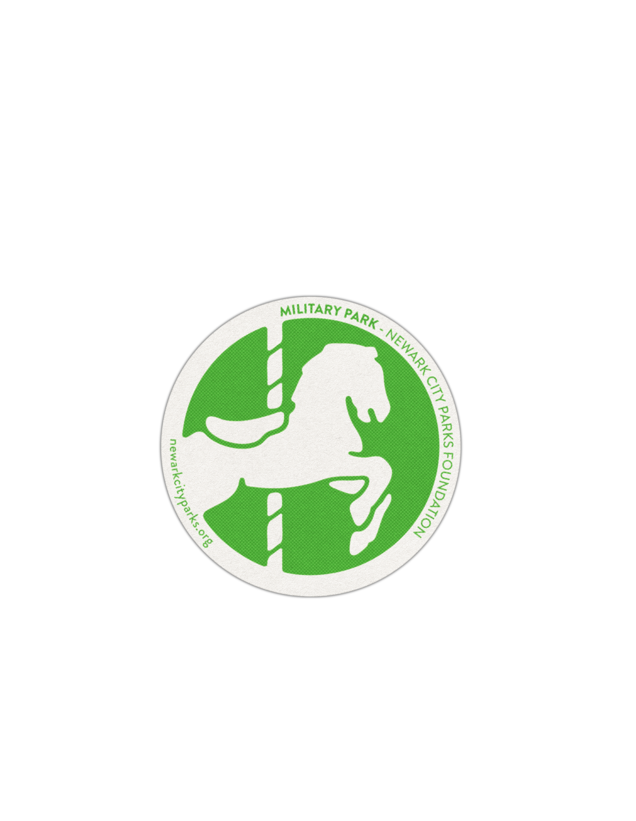
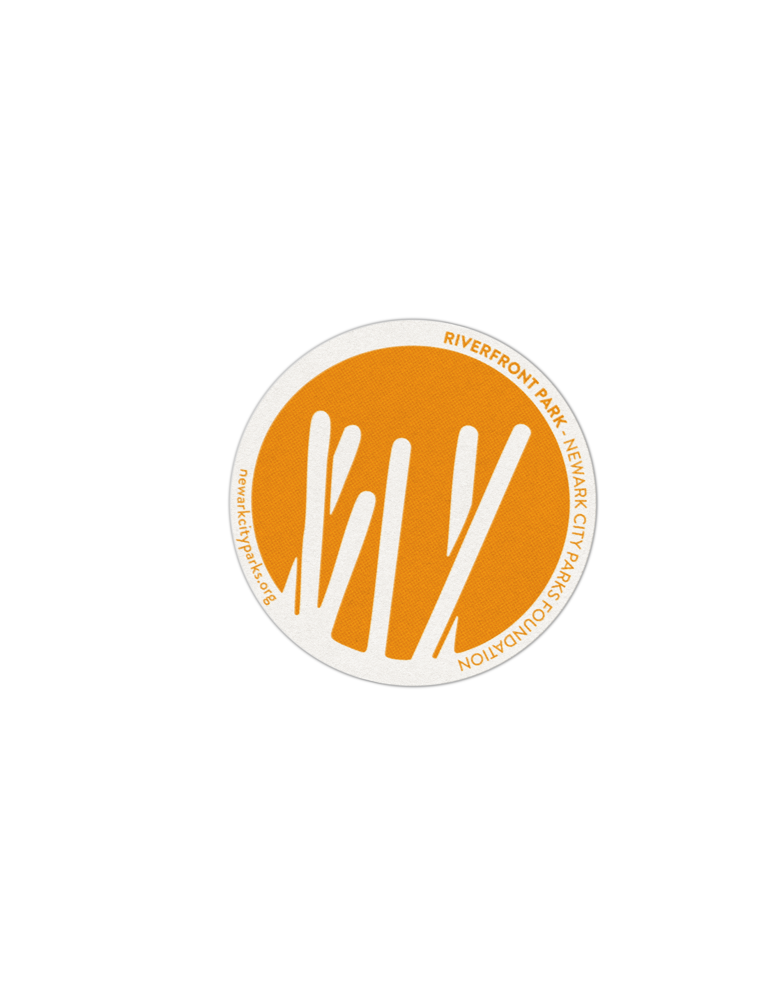
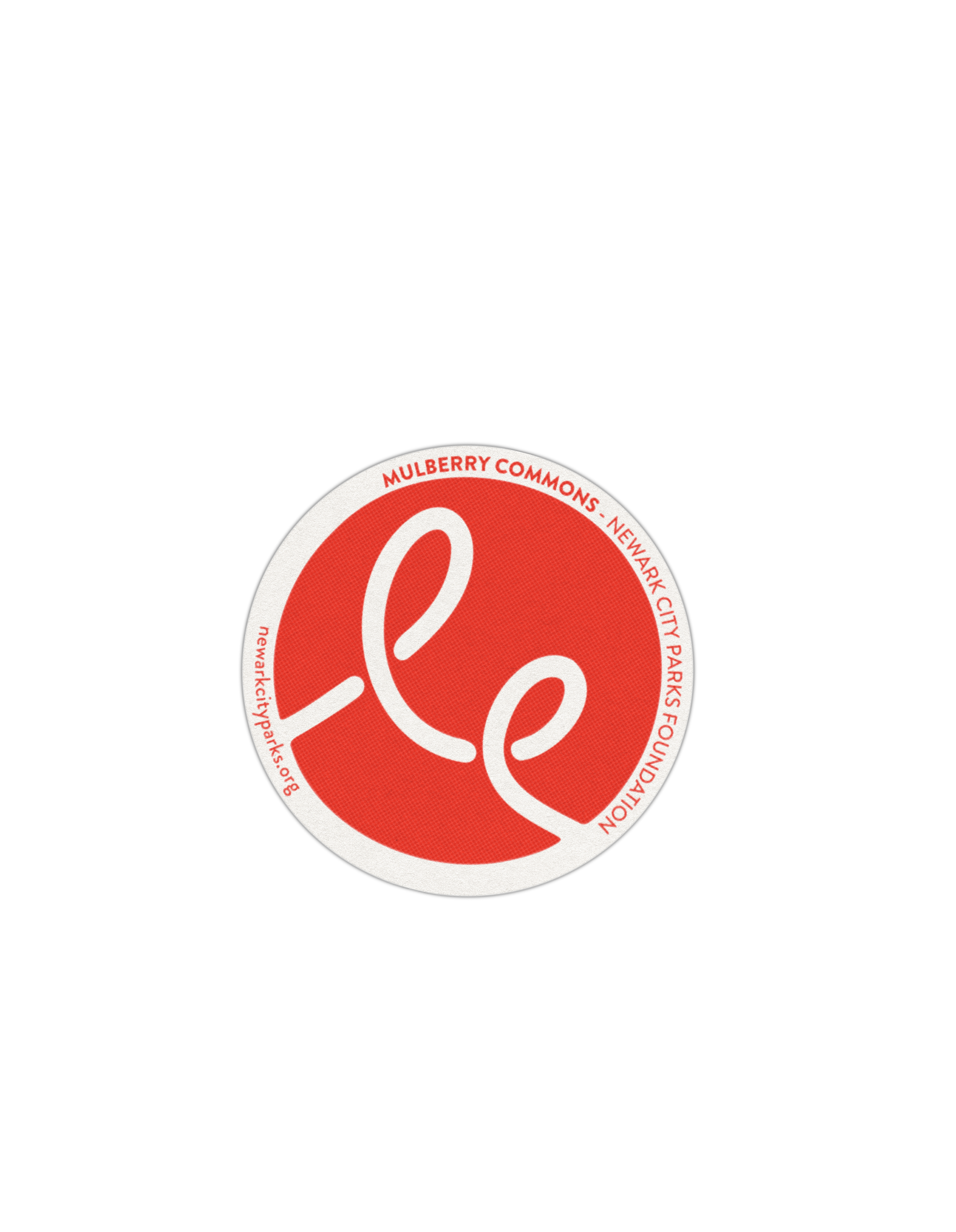
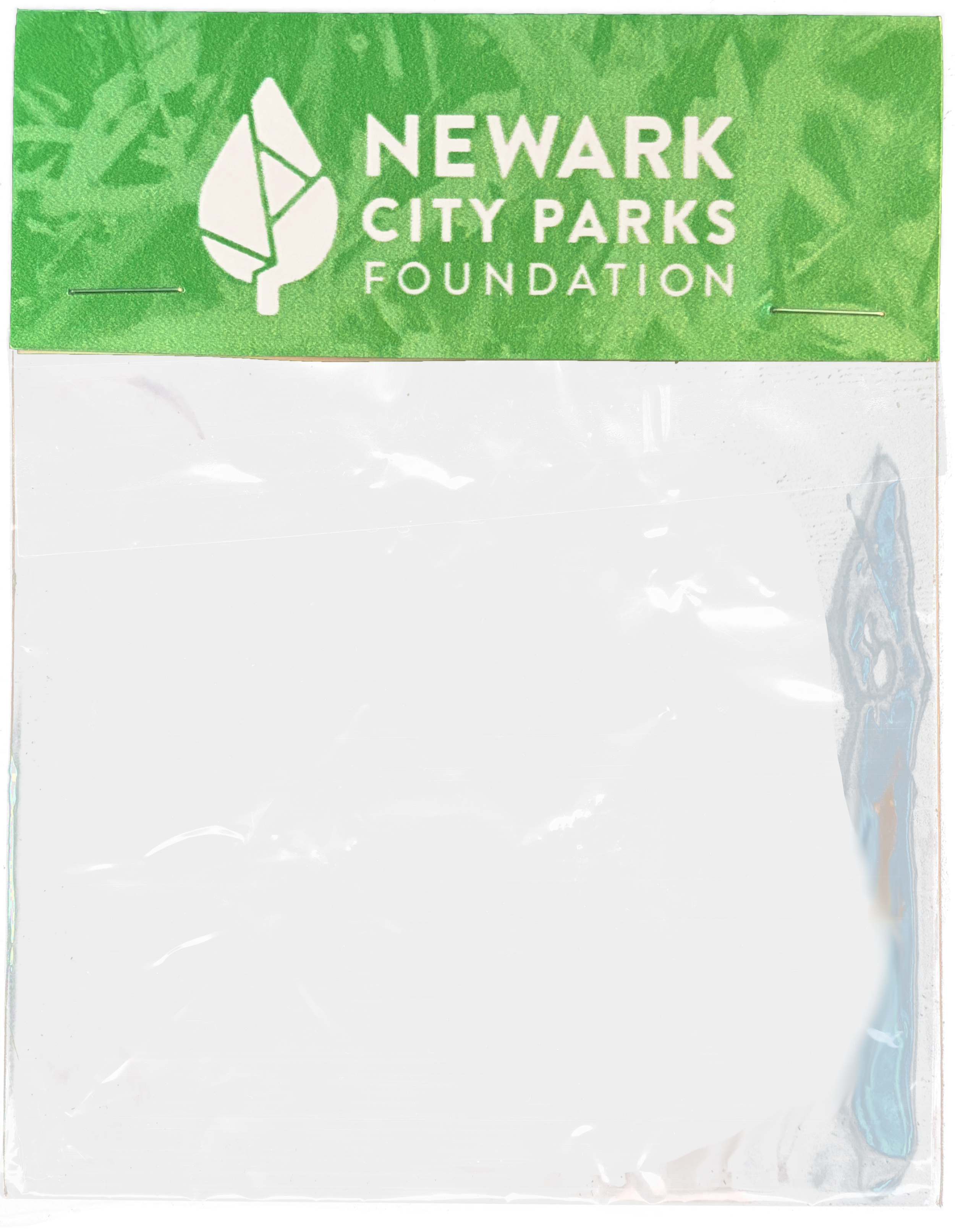
The complete set features the NCPF logo and all five park marks, packaged beneath a coordinated green header card.
STATIONERY - SUMMER EVENTS CALENDAR
The summer events calendar brings programming from all five parks into one colorful guide. Each park’s signature color helps organize the schedules, while bold typography and a collage of community photographs carry the NCPF identity throughout. The calendar invites residents to discover events, explore the parks, and enjoy Newark’s shared spaces.
STATIONERY - SUMMER EVENTS CALENDAR
The complete set features the NCPF logo and all five park marks, packaged beneath a coordinated green header card.
STATIONERY - LETTERHEAD SET
The NCPF stationery set includes matching letterhead, envelopes, and business cards. Green accents and shapes from the logo connect the pieces, while cards cut to the logo’s outline give the set a distinctive touch.
STATIONERY - LETTERHEAD SET
The complete set features the NCPF logo and all five park marks, packaged beneath a coordinated green header card.

As part of The Design Consortium, my goal was to create an identity that felt rooted in Newark and meaningful to the people who use its parks. I was drawn to the connections between the city’s street patterns, natural forms, and cultural landmarks, which helped shape our colorful visual system.
Through the logo, park sub-identities, printed materials, banners, headquarters graphics, and exhibition, we connected all five downtown parks while celebrating their individual character. Each park’s color and symbol became part of a shared identity that could grow with the foundation.
This consistency gave NCPF a more established public presence, making its work easier to recognize across Newark. For me, seeing the identity move from research into shared public spaces showed how design can help an organization communicate its purpose and strengthen its connection to the community it serves.
CLOSING REMARKS
CLOSING REMARKS
As part of The Design Consortium, my goal was to create an identity that felt rooted in Newark and meaningful to the people who use its parks. I was drawn to the connections between the city’s street patterns, natural forms, and cultural landmarks, which helped shape our colorful visual system.
Through the logo, park sub-identities, printed materials, banners, headquarters graphics, and exhibition, we connected all five downtown parks while celebrating their individual character. Each park’s color and symbol became part of a shared identity that could grow with the foundation.
This consistency gave NCPF a more established public presence, making its work easier to recognize across Newark. For me, seeing the identity move from research into shared public spaces showed how design can help an organization communicate its purpose and strengthen its connection to the community it serves.

-
Design Consortium Team:
Camilla Zarzuela, Daniela Murillo-Cifuentes, David Ostrovski, Estrellita G. Matheu Roca, Jasmin Perez, Jean Weekes, Kaviyan Ravindrakumar, Liam L. Gunning, Mansi Patel, Matheus Cueva, and Nikolas A. McLean, led by Visiting Professor Rebecca Pauline Jampol.Newark City Parks Foundation:
Marcy DePina, Marie Thompson, Tawana Meck, and Mouna Musa.Exhibition Design:
Camilla M. Zarzuela and Liam L. Gunning with support from Visiting Professor Rebecca Pauline Jampol and Professor Chantal Fischzang.
This project was created for / in collaboration with the following organizations:


This project was created for / in collaboration with the following organizations:

liamgunningart@gmail.com
2026 Liam Luke Gunning - All Rights Reserved
2026 Liam Luke Gunning - All Rights Reserved
gunning.art
gunning.art
liamgunningart@gmail.com