

Design Process - Bottled Up Emotions

Creating impactful 3D advertisements.
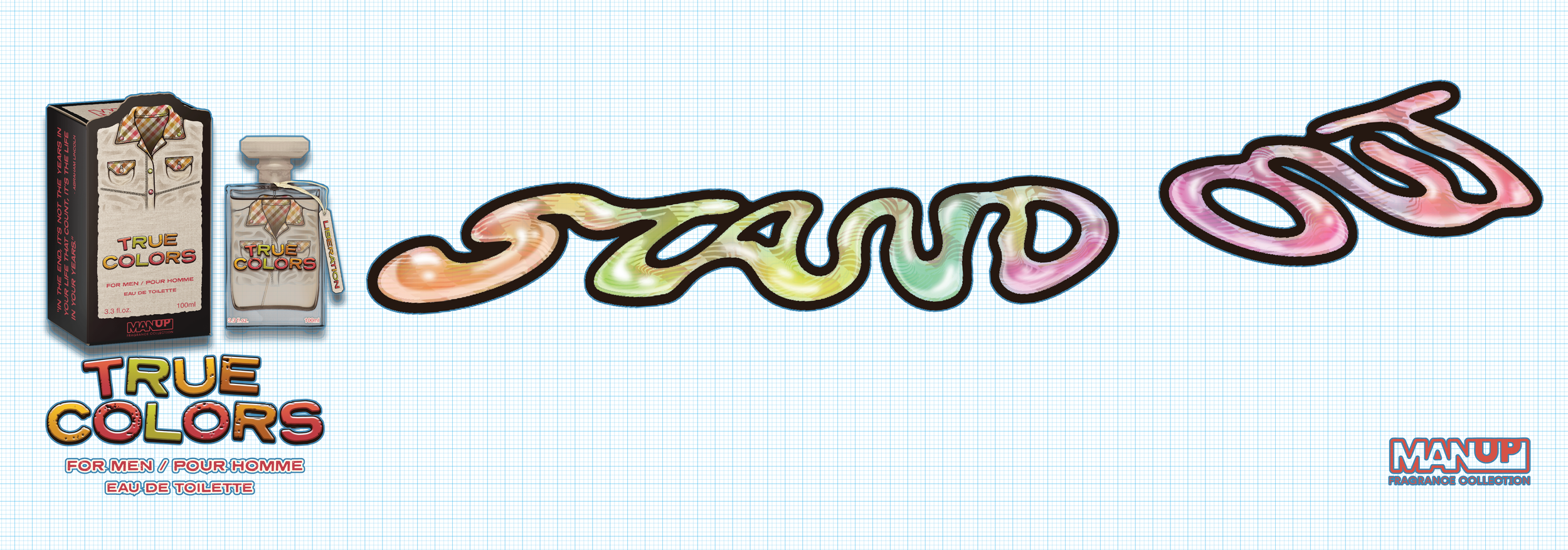
The 3D poster series was developed as a bold extension of the Man Up fragrance collection—each piece serving as a stand-alone advertisement for three of the six colognes, while also deepening the emotional themes behind them. Each poster is a physical composition, created by layering printed illustrations, cut foam board, and specialty papers to give the work tactile depth and visual intrigue.

Abstract ideas into digital drawings.
I began by revisiting the clothing illustrations from each cologne and imagining them within a dramatic, narrative-driven scene. The aim was to re-contextualize the emotion and garment from the bottle into a full visual story—whether through the melting socks of True Colors, the outstretched arms of Suit Noir, or the smoking-gun cologne bottle in Nothing to HYDE. These compositions were carefully planned digital drawings, they were then translated into layered physical builds.


Printing the graphics.
Transforming my digital illustrations into physical, dimensional posters required carefully reworking each image into segmented print files. Once the compositions were finalized digitally, I broke each drawing down into distinct visual layers—foreground, midground, background, and special elements like text or accessories that required specific print settings. These layers were then exported individually, allowing for precise print separation across different materials.


Building 3D elements.
Each element was hand-cut and assembled, often incorporating materials like transparent film, textured card stock, and layered foam board to emphasize different visual effects such as transparency for smoke or liquid, dimensionality for shoes and suits, and even real materials, like string shoelaces or textured stickers, to blur the line between illustration and object.
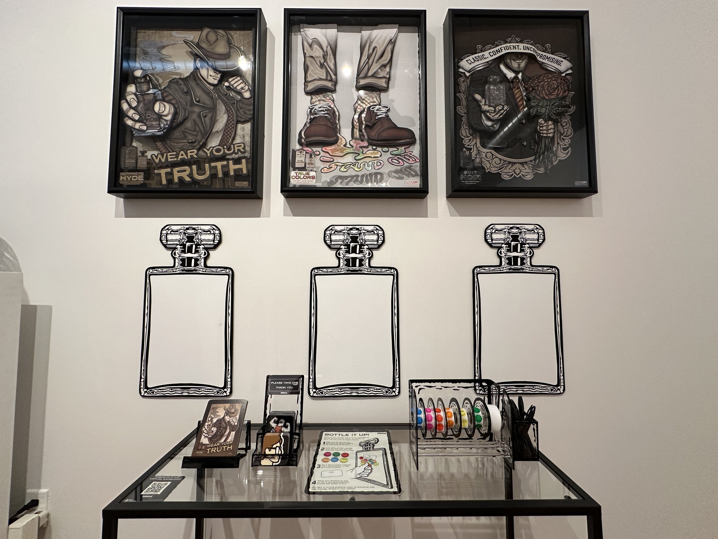
Building the depth between elements was one of the most technical—stages of the process. Each advertisement had to fit seamlessly within a fixed-depth frame, requiring me to carefully plan how the layered elements would build forward without overwhelming the composition or colliding with the glass. Using foam board spacers, I stacked each print layer with precision, adjusting for both visibility and depth.


Framing the compositions.
To push the 3D illusion even further, I mounted select visuals directly to the interior glass of the frames. This included elements like logos, floating text, or light foreground imagery that was designed to hover in front of the main composition, creating separation and tension between layers. This technique required delicate adhesive placement and exact measurements to ensure everything aligned with the background scene without visual distortion.


Interactive element design.
To deepen audience engagement with the shadow box series, I built an interactive feature that invited viewers to physically participate in the emotional themes of the work. I began by custom painting a sticker dispenser with black acrylic accents to echo the retro aesthetic of the CRT television used in the video component of the project, creating visual cohesion across mediums.
I then collaborated with fellow graphic designer Jhoselyn Contreras, who laser-cut a set of custom rubber stamps. Using these, I hand-stamped over 600 emotion stickers, each one offering a word like “HAPPY,” “CONFIDENT,” “INSECURE,” or “NOSTALGIC.” Viewers could choose a sticker that resonated with them or write in their own emotion using a blank—and then place it on one of three foam board cologne bottle cutouts positioned beneath the corresponding poster. Each bottle mirrored the shape of the cologne series and served as a growing emotional archive, collecting responses over time.


Making the poster series series real.
Each 3D shadow box advertisement was mounted just above eye level, allowing viewers to fully engage with the depth, detail, and texture of the layered illustrations. Positioned directly beneath each frame, the foam board fragrance bottles and custom sticker dispenser created an interactive zone where audiences could reflect and respond emotionally.
The space was designed to feel both intimate and impactful, inviting close inspection while also showcasing the emotional scale and complexity behind modern masculinity. By combining physical craftsmanship, historical references, and hands-on participation, the installation transformed the gallery into a dialogue between the viewer, artwork, and the layered expectations of what it means to “be a man.”


Use the arrows buttons or swipe horizontally to view. Click the buttons to explore the design process.


2025 Rutgers University Newark.
Graphic Design Senior Capstone Exhibition - Common Ground : Perspectives on Freedom


