


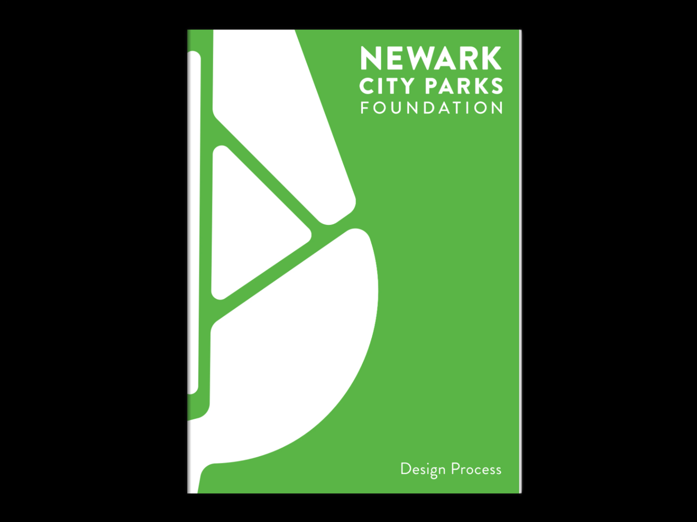
DESIGN PROCESS
From concept to reality, this section documents the visual development of the Newark City Parks Foundation’s refreshed identity. Each element was carefully crafted to reflect the spirit of Newark’s five downtown parks and the community they serve.
Click on a topic to go to section.
Mood Board
Satellite Imagery
Cartographic Forms
Logo Exploration
Logo Mark
Typeface
Logo Lockup
Process Book
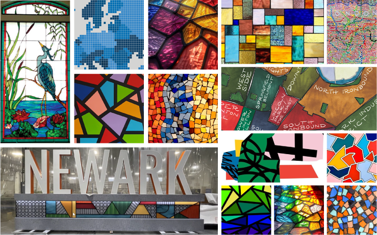
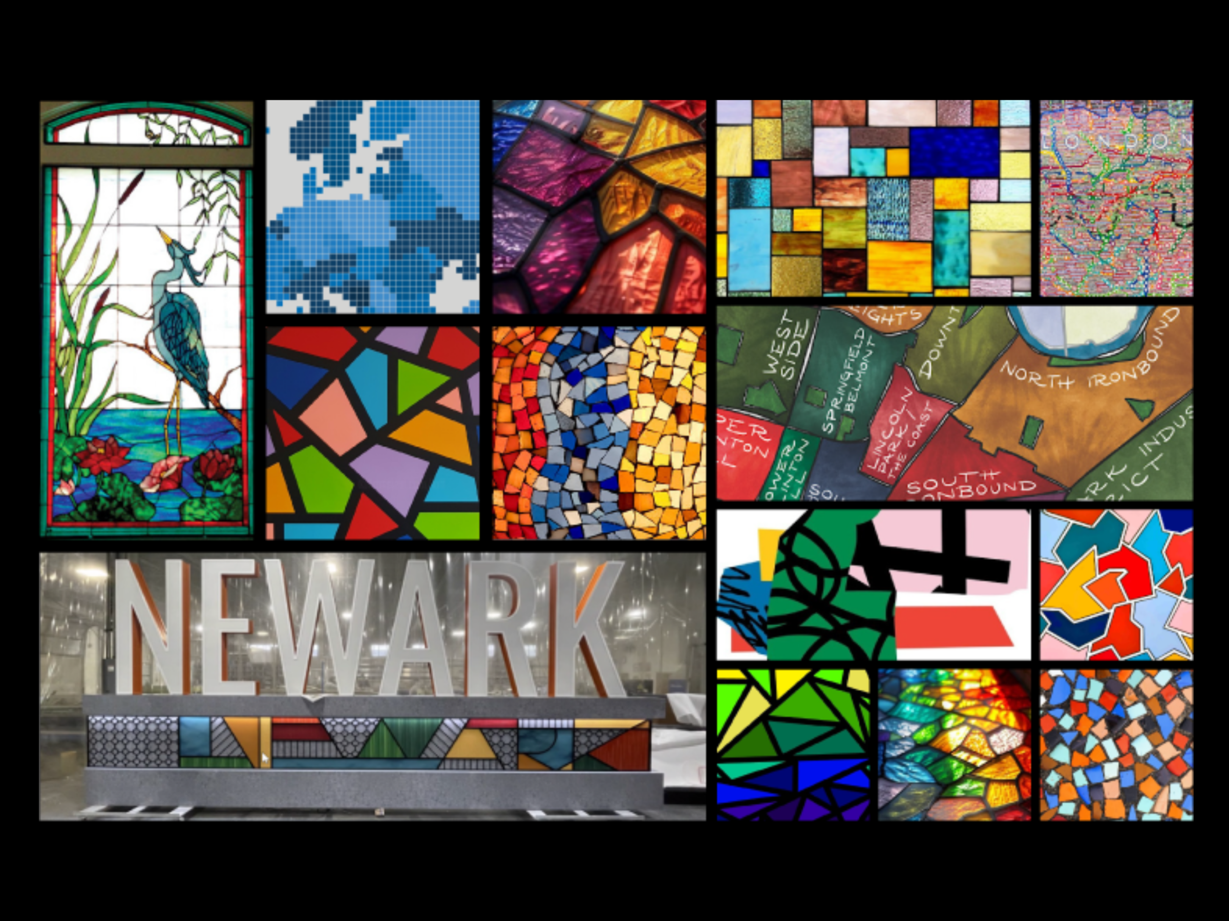
Research | Inspiration Board
Our research began by exploring mosaics and interlocking geometric forms, drawing inspiration from their visual and structural similarities to cartography. These intricate patterns reflect the interconnected nature of Newark’s parks, neighborhoods, and histories. The team and I were particularly drawn to the use of lively colors and dynamic interlocking shapes, which capture the vibrancy of the city and its diverse communities.
Image credit to original authors*
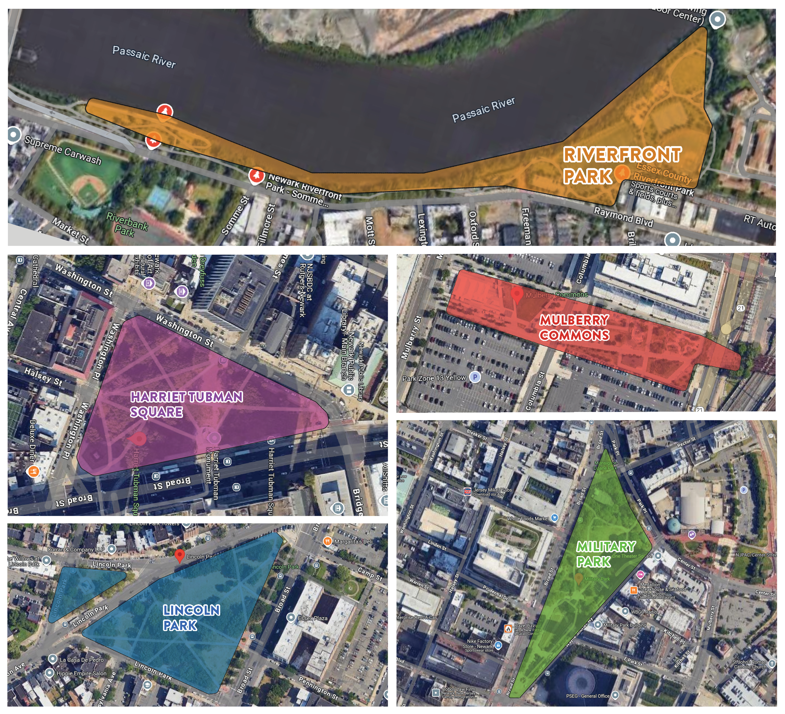
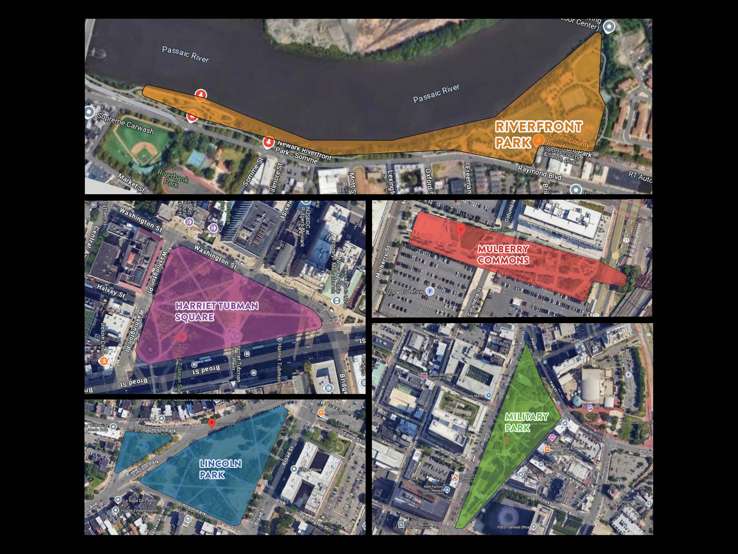
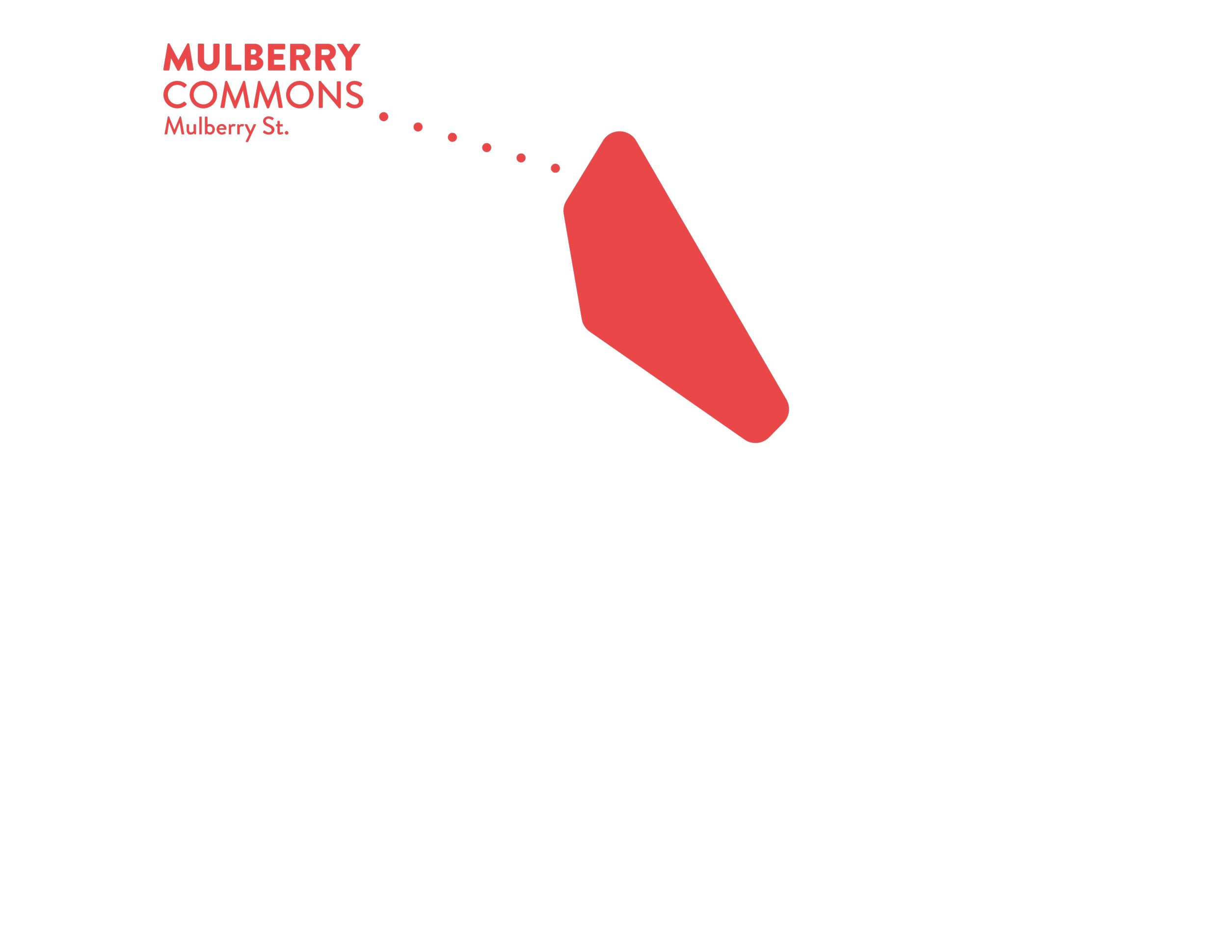
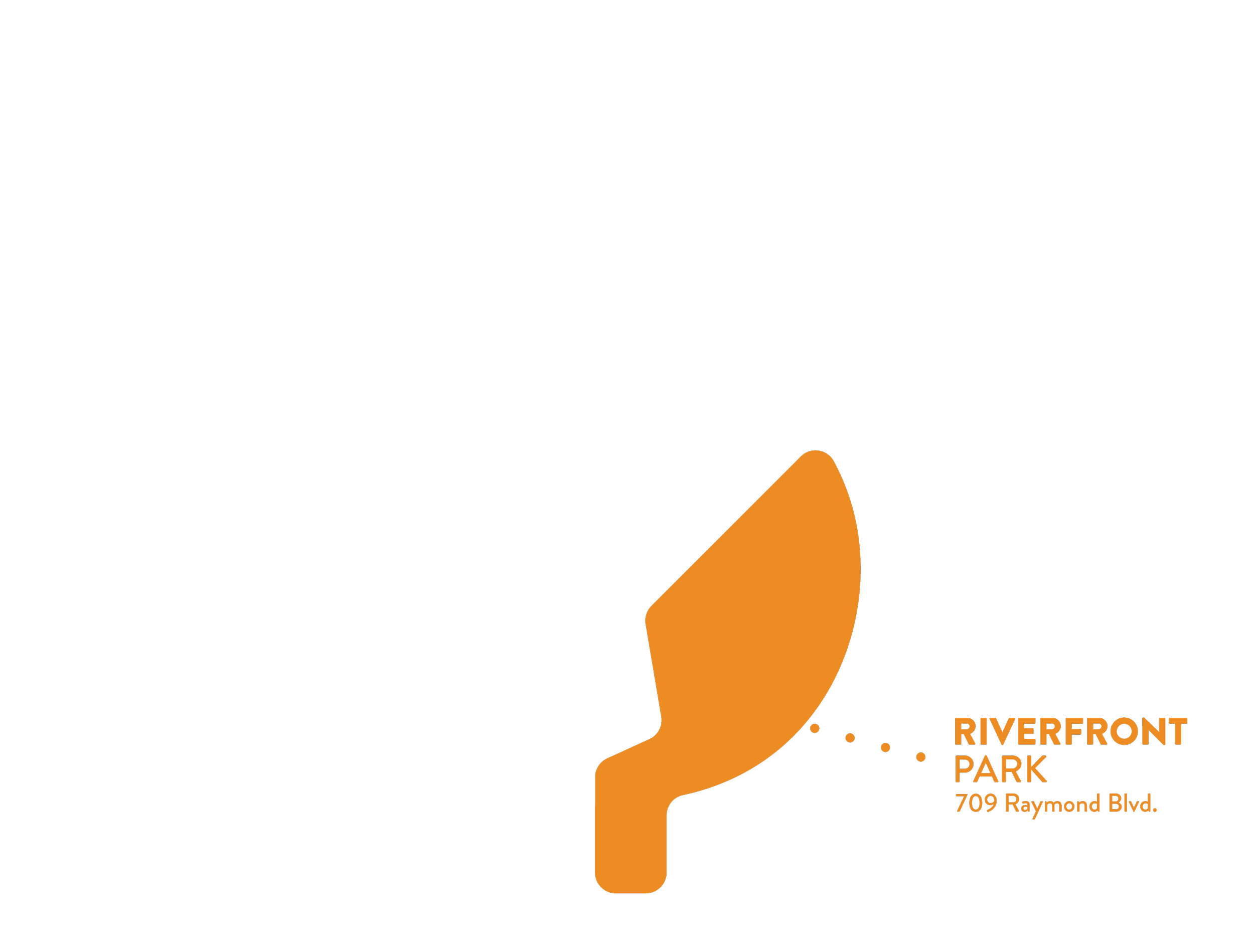
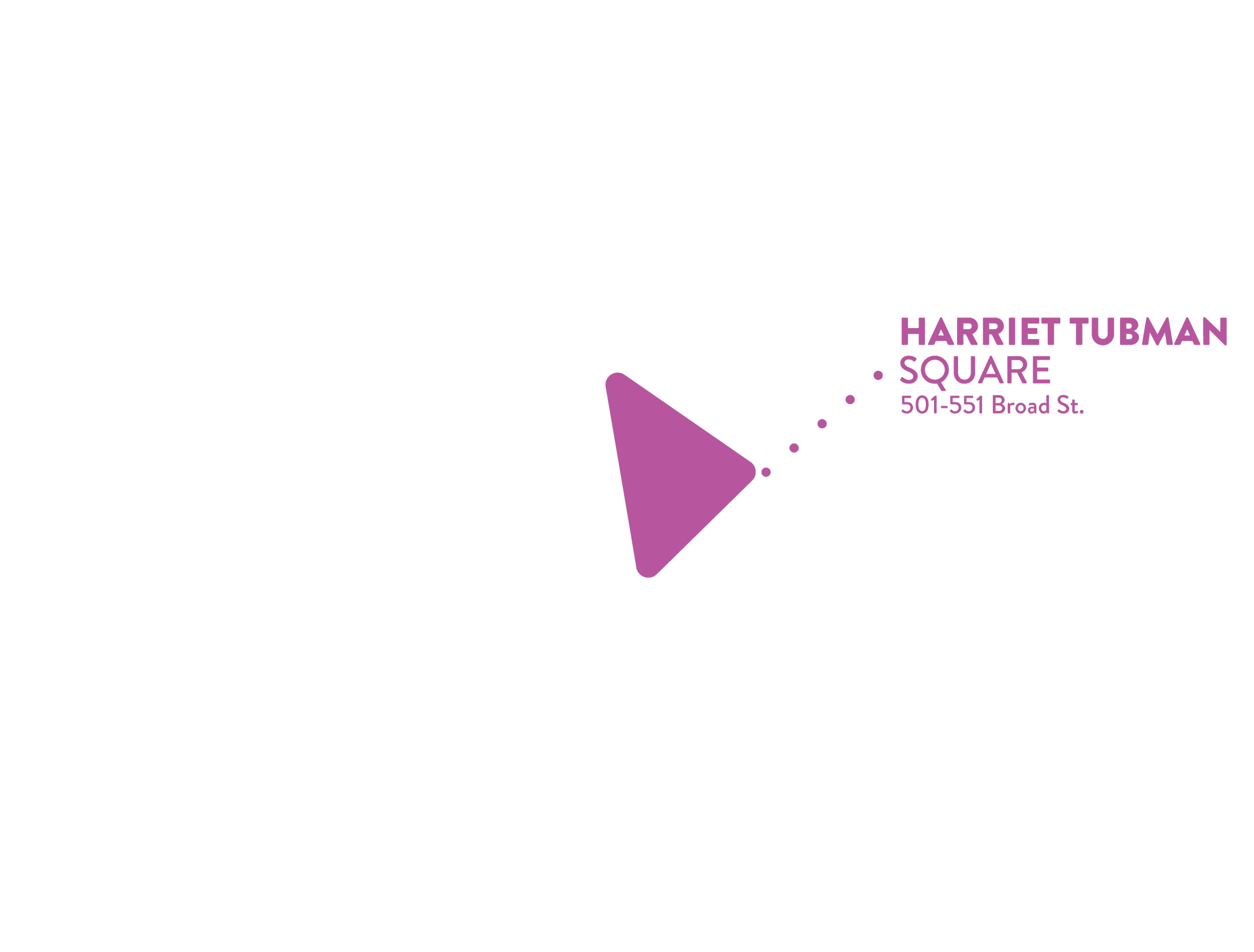
Building on the exploration of mosaics and geometric forms, the team and I turned to satellite imagery from Google Maps to extract the distinct shapes of Newark’s five major parks. By analyzing their boundaries and layouts, we were able to identify unique geometric forms that became the foundation of the brand’s visual language.
Research | Satellite Imagery
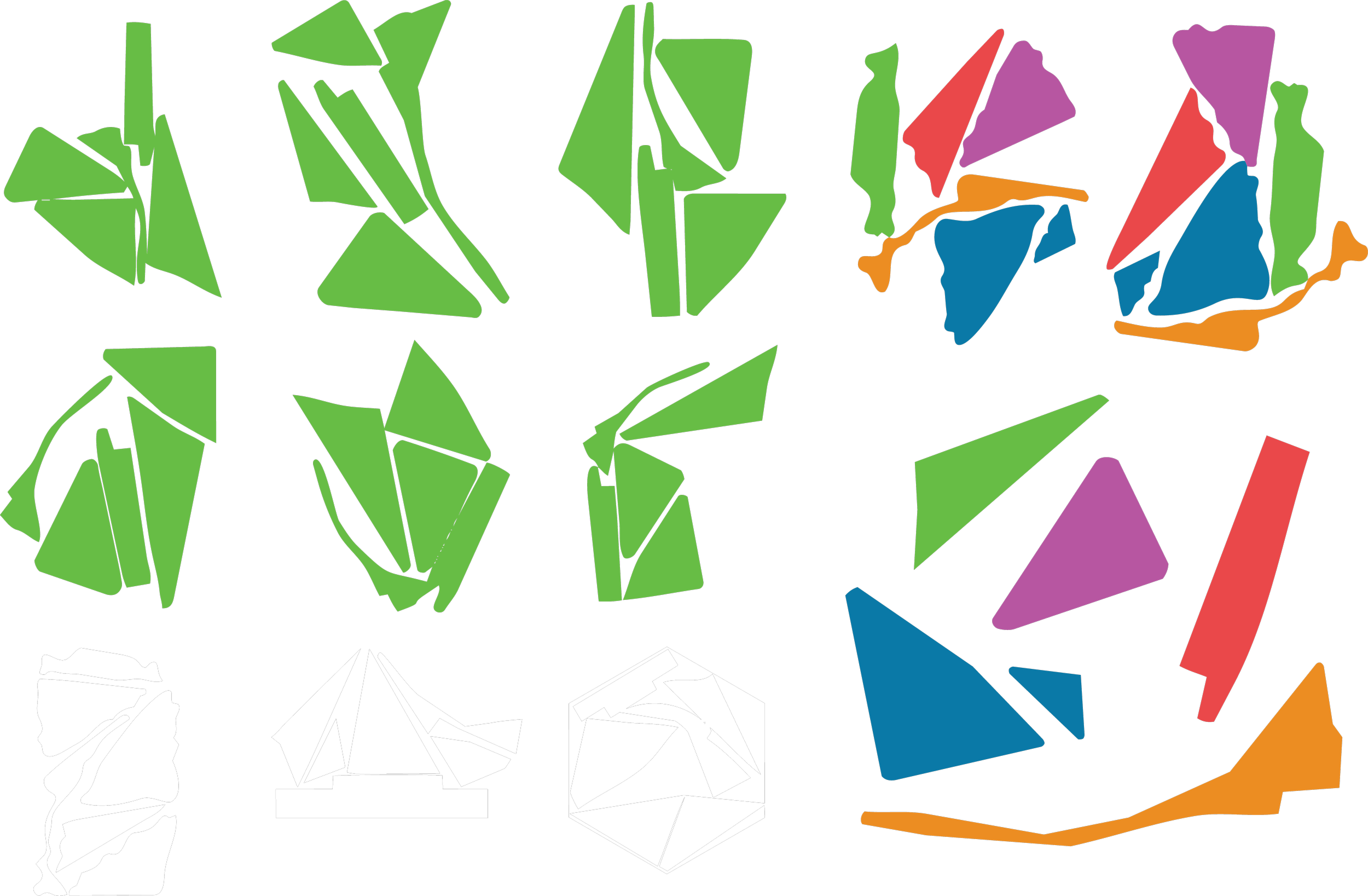
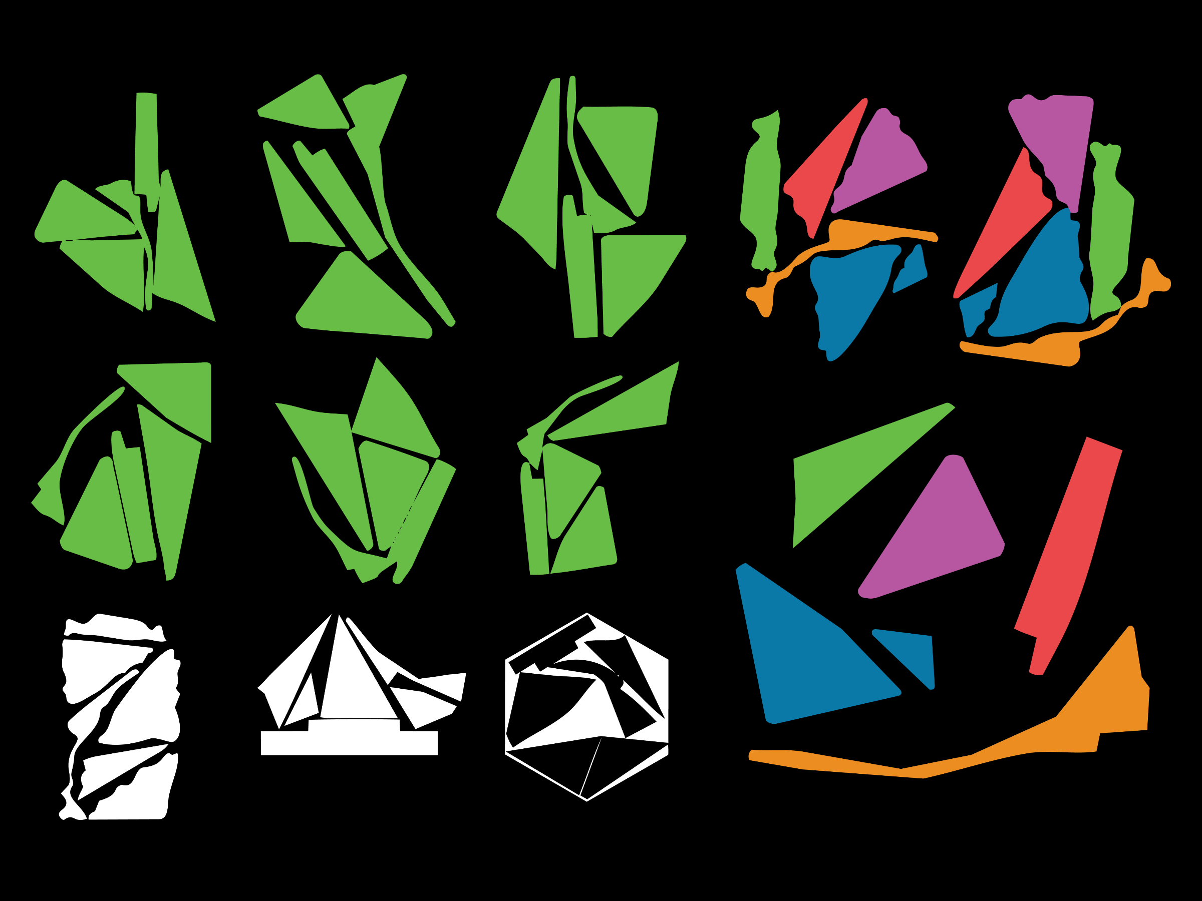
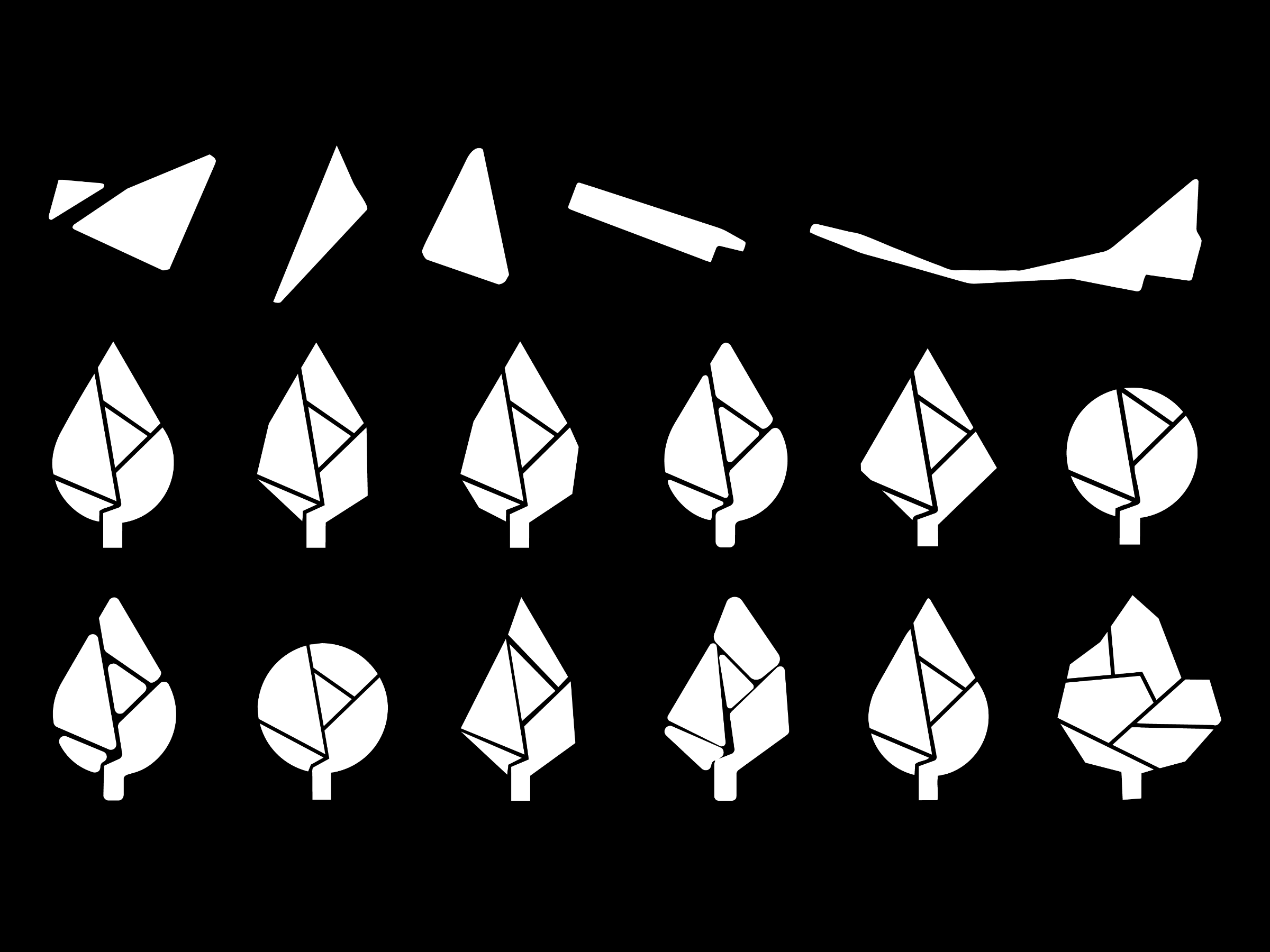
Ideation | Cartographic Forms
The team and I explored how these park shapes could interact to form a more unified and harmonious design. By abstracting their silhouettes and softening rigid edges, they created a more fluid and approachable visual system. Incorporating colors inspired by NCPF interviews, they transformed these cartographic forms into vibrant, dynamic elements that reflect the energy and accessibility of Newark’s parks.

Ideation | Logo Exploration
From these foundational elements, we expanded the NCPF brand, creating a more cohesive and approachable identity. We refined the leaf silhouettes to feel more organic and inviting while maintaining their recognizable forms. The parallel lines were transformed into city street inspired pathways to integrate more seamlessly with the cartographic-inspired shapes we developed for the parks, reinforcing a sense of infrastructure.
Hover over a section to reveal the park.

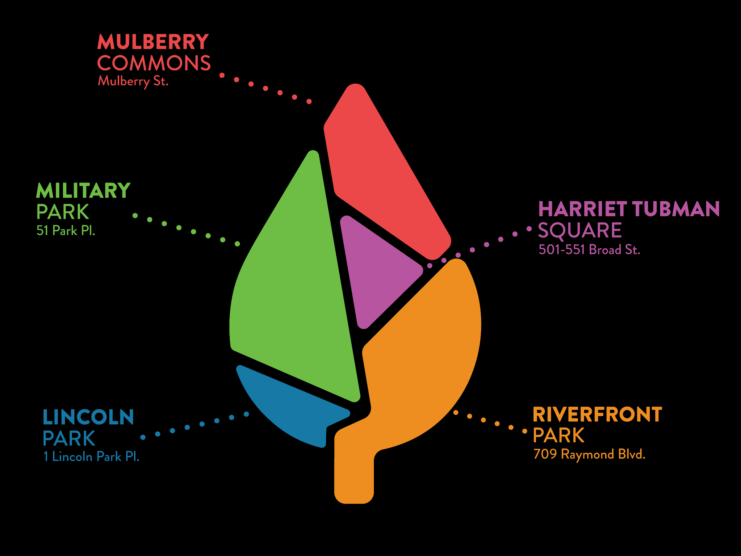
Identity | Logo Mark
The design team and I crafted the NCPF brand identity to merge familiarity with a refreshed visual language. At its core, the rounded leaf silhouette incorporates the cartographic shapes of Newark’s five major parks. These forms, separated like the city’s streets, symbolize both unity and accessibility. The resulting design bridges Newark’s natural spaces and urban structure, creating an identity that is clear, inviting, and rooted in the city’s landscape.


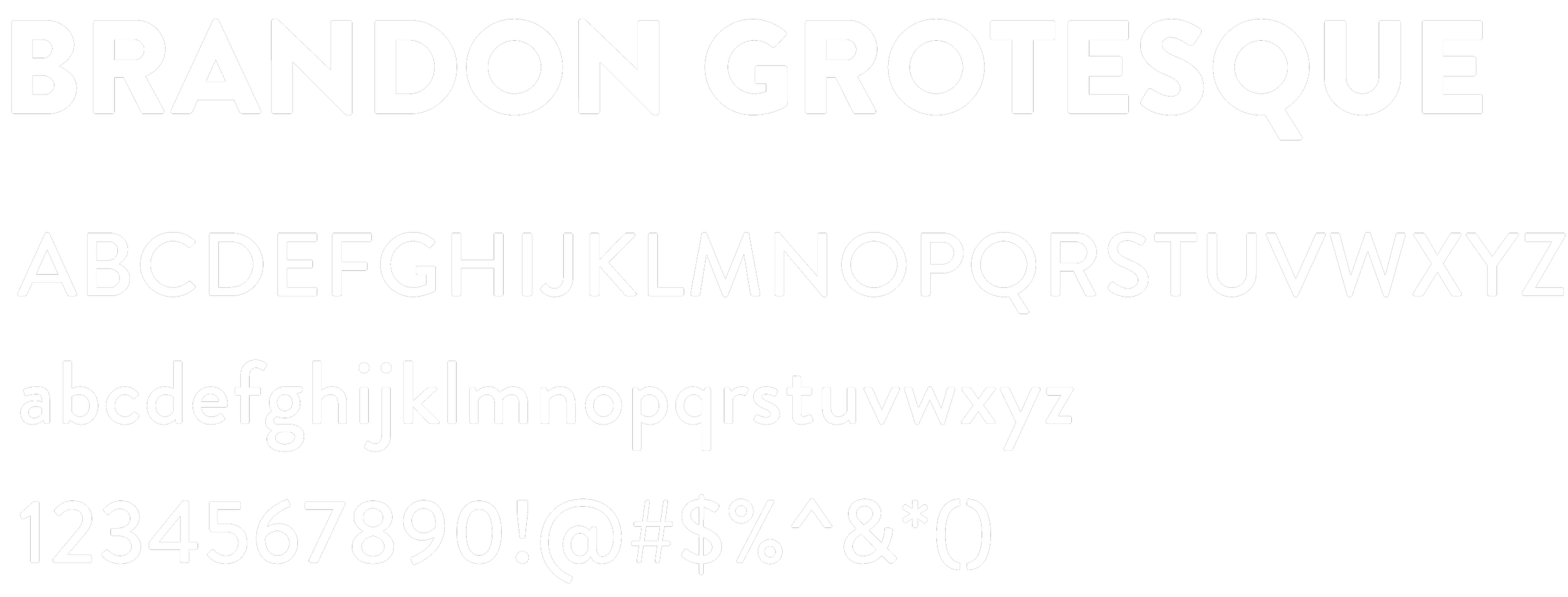
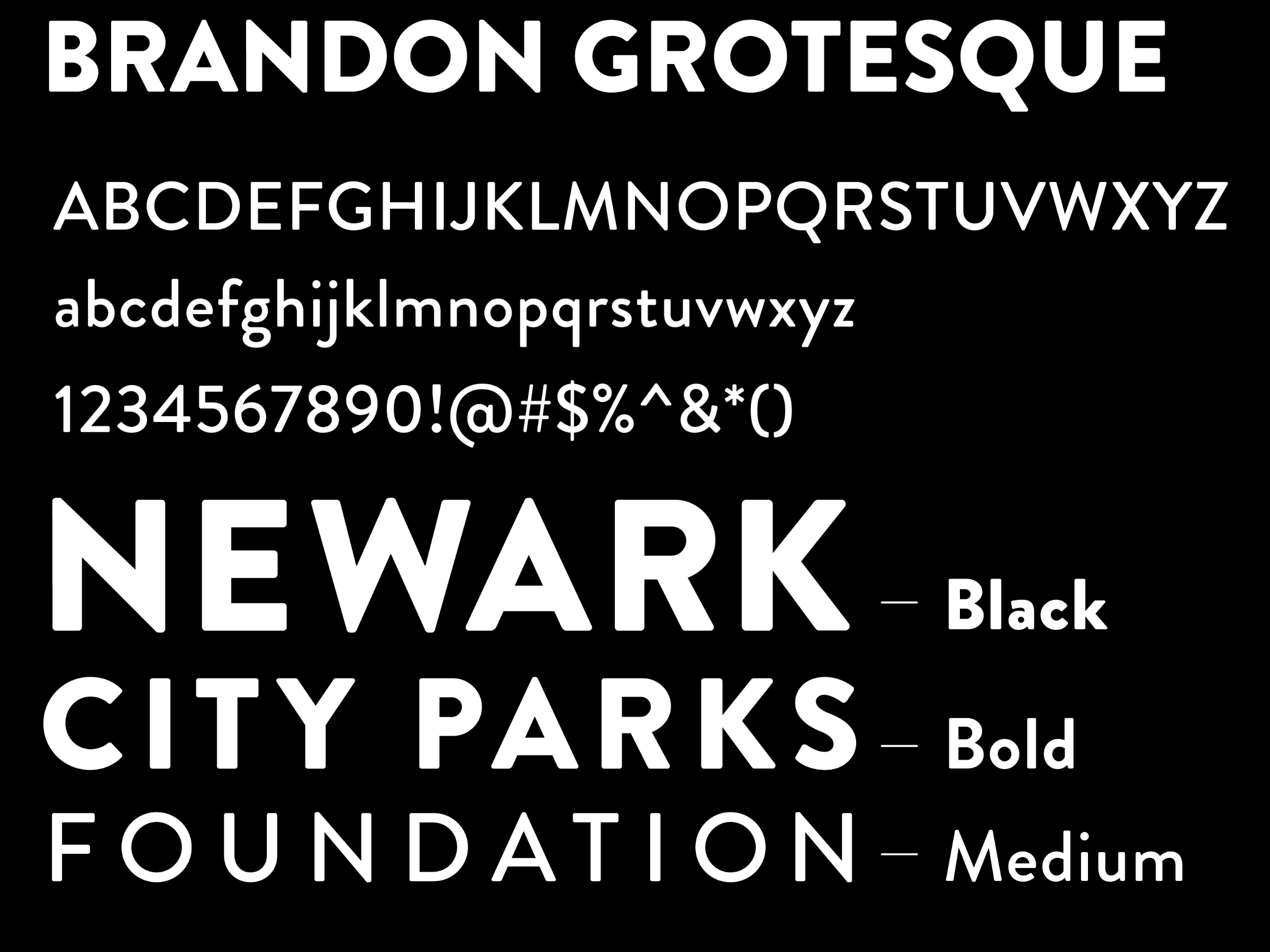
Identity | Typeface & Wordmark
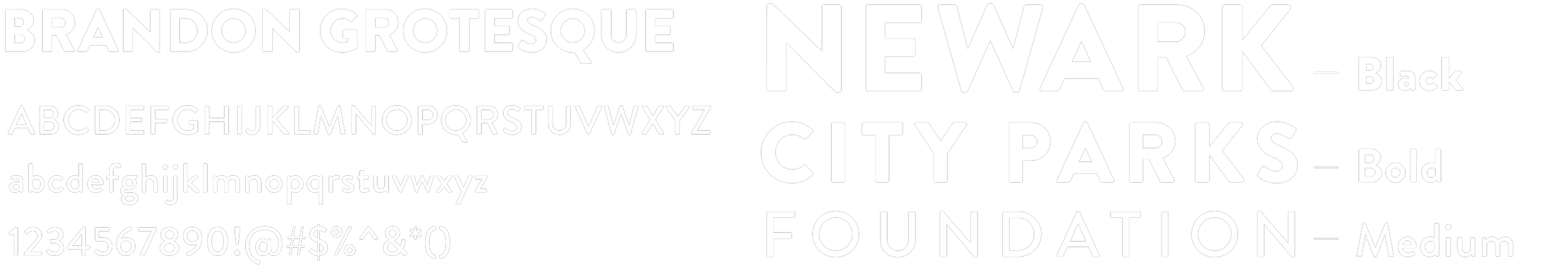
As we refined the NCPF brand identity, selecting the right typeface was essential to reinforcing the project’s visual and conceptual themes. Brandon Grotesque was chosen for its ability to balance a dynamic industrial aesthetic with a bold yet approachable appearance. Its strong, sharp lines echo the structured elements of cartography and Newark’s urban landscape, while the rounded edges maintain a sense of playfulness and accessibility.
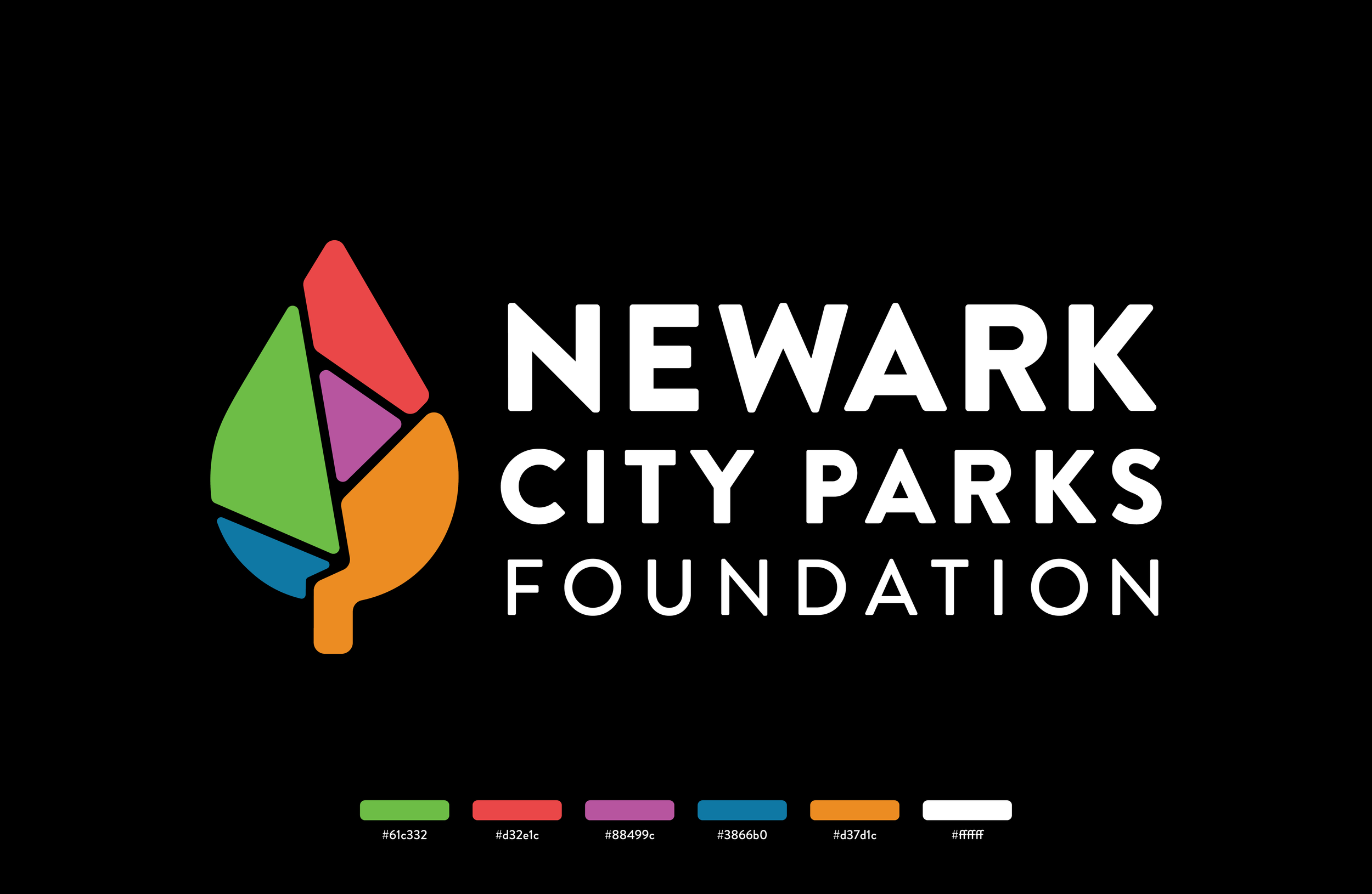


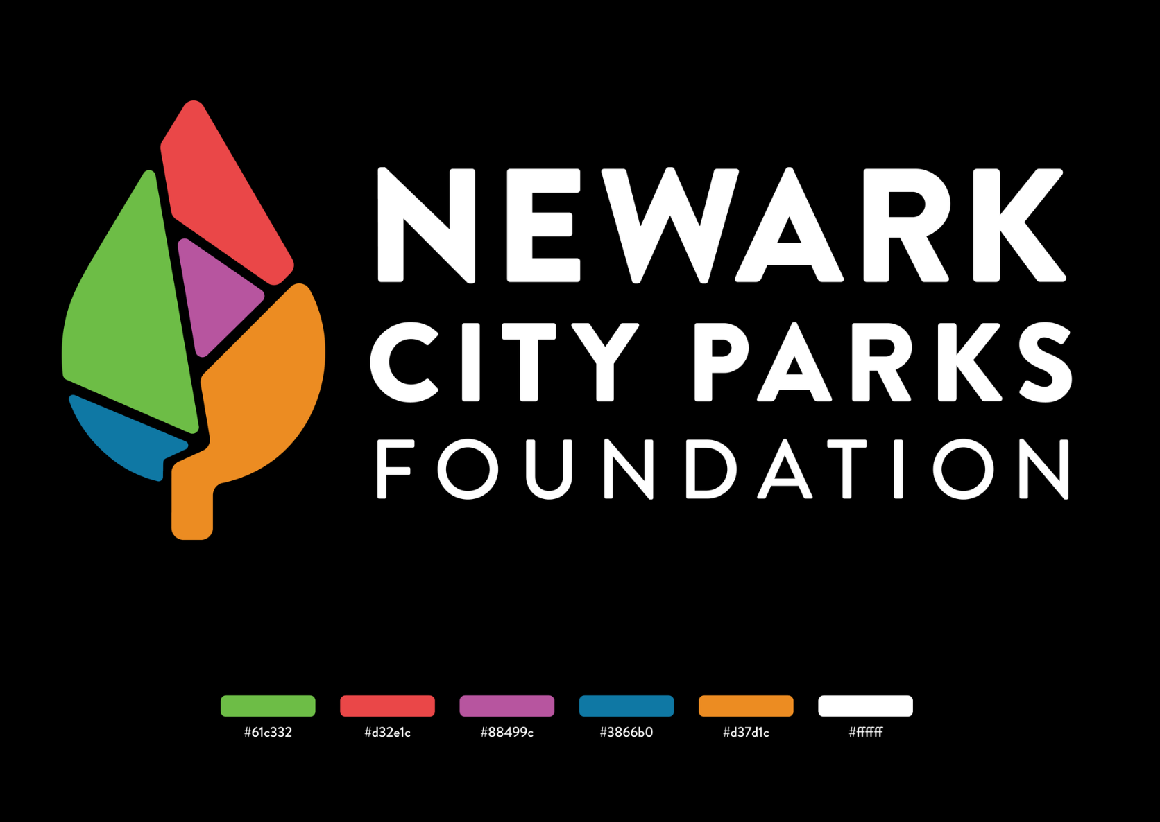
Identity | Logo Lockup
As a final way to compile our process, we created a 16-page booklet documenting the development of the Newark City Parks Foundation brand logo and wordmark. It highlights the design process through digital sketches, iterations, and applications, serving as a concise record of the brand’s visual identity.
Identity | Process Book
As a final way to compile our process, we created a 16-page booklet documenting the development of the Newark City Parks Foundation brand logo and wordmark. It highlights the design process through digital sketches, iterations, and applications, serving as a concise record of the brand’s visual identity.